3DS Max
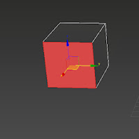
The start of modelling in 3DS Max, the first objects i ever did was model a box and a barrel.
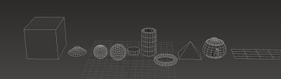
The basics of 3ds Max are learning the standard primitives which are the box, cone, sphere, geosphere, cylinder, tube, torus, pyramid, teapot and plane.
These are the standard primitives that you use to create buildings, cars, weapons, and loads more. you go from a simple box to a high detailed building in a few hours if you are good enough.
The small square in which says front is to rotate around the scene or you can hold alt and the mouse wheels down to also rotate.
These are the basic shapes of each primitive, from the left is the box, and then cone, sphere, geosphere, cylinder, tube, torus, pyramid, teapot and then the plane is on the right. that is the order of all the shapes that you can use.
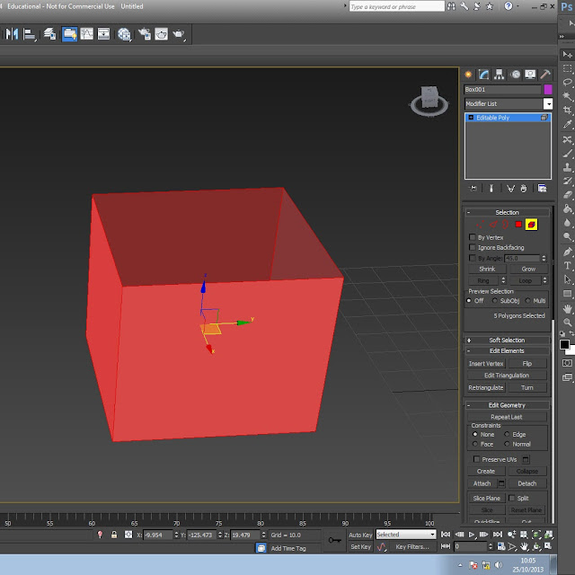
I will now show how the vertex, edges, border, face and element effect a shape you are using in editable poly. Before i start editable poly is something that we use to edit faces and points on a model which then allow you to change stuff.
1st part of editing is learning what this is the red selection tools are this one is the vertex and this allows you to edit all the points of an object and then you can move them up and down and side to side just like if you was moving a whole model.
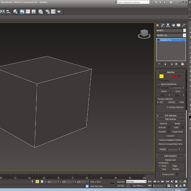
This is the edge tool and it allows you to edit the edges of objects and you can move up or down to get
the right shape you may need.
The border allows you to fill a whole in a model, you can click on the button on the tab which you can see is called cap and that caps the hole so it is a solid face again, you can only use this if there is a hole as the border option isn't something you would use because if a face was there you would click on edge and "ctrl" to add over edges to the selection.
This is the tool which is the red square on the tab bar which i haven't included in this image but this allows you to pull it out and make it a bigger shape without making a new edge. To make a new edge you can click on the button in the image below called extrude and this does the same thing but you create more edges and faces and this then allows you to do so much more.
The final primitive is the element button and this hightlights the whole object that are are selecting and then with this you can it around and see all the faces. The dark faces and the light faces are different, this is because it shows you the faces that are on the outside and the and inside, the bright red faces are all around the object and will be able to be textured but then the dark faces show where can't be textured. To be able to texture the inside you can use the button on the modifer list called shell and it creates a slim edge but creates more polly's and tri's but it gives you an option to have a a different texture in the object as they are new faces. The shell tool is one option that you can use.
This is the final outcome from the task of creating a box and barrel.
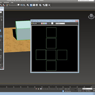
Unwrapping - when you unwrap a box or barrel, it comes out like so. it is a net which you paint over with a texture and then when the texture is complete the 3d model will have the texture placed on the model in 3ds max
This is the start of the unwrapping process, you click editable poly and then Unwrap UVW, and then open UV editor and then you get that pop up and then you get this image where you have to click and drag and re-scale to fit in the small checked box. The image shows a red box which show the faces and then you have to save it and then bring it into photoshop to edit and make into the texture for what ever it needs to be.
To do a cylindrical unwrap you need to select a cylinder primitive and then follow same instructions as unwrapping a box but you click on cylindrical unwrap instead of planar map.
You then do the same process but the unwrapp is a cylinder and will unwrap like if you cut down the centre of a can of coke and pulled it apart it would be a long rectangle when it is open.
For this task we had to unwrap the back to the future car. The delorean already had a pre-made texture, our task was to match the care faces to the unwrapped texture.
Texturing is a vital part of the 3D process, you need to be able to unwrap to get the most out of the models you create, a single texture can give a model so much more depth and character, so it is vital to make sure that the textures are correct and tidy.
In this image you can see the texture map which is already been applied, you then have the faces sized and made to fit each area, for example all four car wheels, will be on top of one and other as they all look the same so there is only need for one wheel on the texture.
This image shows us which areas are highlighted and which are not, the highlighted areas will not have the correct texture on as the unwrap is not in the correct place so it will look strange and of balance.
The image shows us that all of the textures are in place on the unwrap and the car textures look in place so it now looks complete.
Another part of this task was not just to have the textures in the correct place, but we also had to build other parts onto the car, I did the large rockets and power supply on the back of the car which was a unique part of the car from the films.
Tile Texure
This method works well for buildings, stand alone walls and floors, i have taken this stand alone image of the floor. i then took this image and put it into photoshop. I then used the spot healing button and content-aware button. With this i took off all the leafs and rocks to make it flat so it looked like a tile texture and can be doubled and dublicated to fit any region size.
The model is the bottom image and shows how the texture is tiled, and how it has tiled itself over a number of planes,
this image shows the floor with the texture on it and how it shows off being known as a tiled texture.
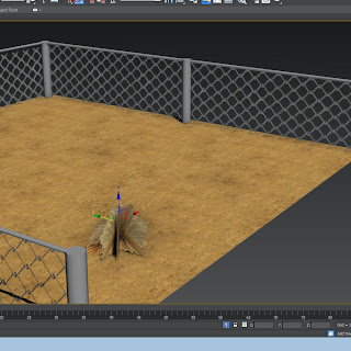
Alpha Map, this method has been used in the imdustry for years, it is used for many different uses from chain fences to trees and grass. The first step is to get you piece of grass or fence and then put it in photoshop and then make it black and white which is the alpha map, the piece that is seen is the white part and then the other bit is black which wont be seen as it becomes see through. You keep the colour copy as well as that is the defuse copy and with that you put it into 3ds max on the material editor and choose bitmap and then put the defuse copy in first and then click on go to parent and then click on opacity and then choose the Alpha Map which then makes it see through when you click on show in viewport. The image shows the viewport selection tabs.
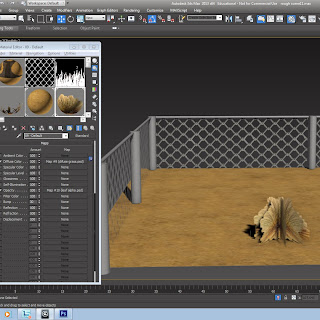
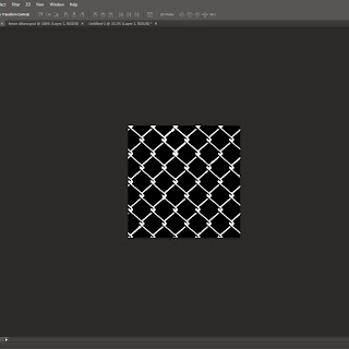
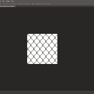 The two photoshop images show how doing alpha maping in 3ds max looks. The images i have here are two different shots of a fence but it could be anything, it could be a red blop on one background which would be the colour image and then a pure black background with white blobs and then the colour blob is goes behind the alpha map image and then you can only see the white blobs, but in 3ds max the bounding box will still be there as it is still a square plane even though the plane has maybe a fat blob. This is shown well with my fence alpha map and you can see the fence and the holes that are see through, but this is because the black spaces are see through and the white bit is part of the object that gets seen in 3ds max.
The project that i was doing and have been working hard on today has been the bin design. With this project I have included the use of ambient occlusion which basically creates shadows and makes it seem and look more realistic. This is step one, the first step is in Photoshop and you need to make sure that you have all of the layers that you have been using flattened until its one layer.
This image shows the UV-unwrap, as a normal Photoshop file. Then the next step in Photoshop is to give it a sense of realism and depth, this is created with the help of ambient occlusion.
When the file is imported into Photoshop from 3DSmax the image is black and white, this is then placed above the colour image and you click on multiply which is on the layer selection tab where it normally says normal. you click on that drop box tab and then this list pops down with the different options. You click on multiply and then you get the final look for your object. You now put this saved file into 3DSmax and put it in the material editor like normal and then place this image link in the defuse section.
This is the beginning before the Photoshop steps, you need to make sure you make the material editor a mental ray and then you can proceed forwards by clicking off this.
The next step is making sure that you have all of the items attached, then you make sure that all of the little bits like element type the height and width is all set to your points, for example the height and width needs to be the same size as the Photoshop file, mine is 1024 in Photoshop so I have made sure that it is the same in 3DSmax.
This step is the next step and with this you need make sure that the file is outputting to the correct file path. then you can go down and click on render and then you go back into Photoshop to proceed forward.
This is a link to my final bin.
Animation.
In animation there are 12 principles set by Walt Disney animators Frank Thomas and Ollie Johnston that are important to create a realistic animation.
Squash and stretch
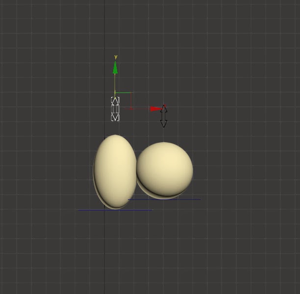
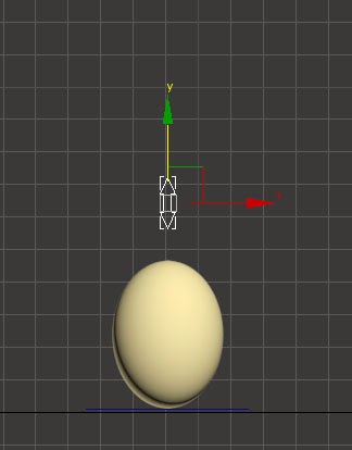
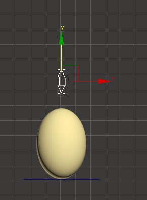
One of these and perhaps one of the most important is squash and stretch. Squash and stretch is something that is used in animation, it is used to give it character.
In the case of a bouncing ball:
Squash = Ball hitting an object
Stretch = Ball moving fast or falling
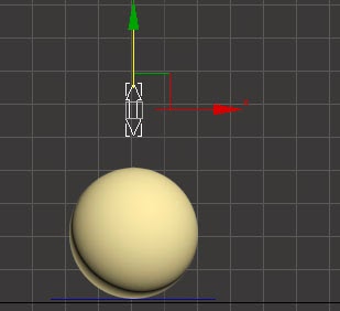
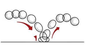
The purpose of squash and stretch is to show weight and volume /mass of the ball.
Lots of squash and stretch = it would be something like a bean bag, or stress ball, if you through it it will squash because of the material.
Minimal squash and stretch = items with minimal squash and stretch could be a ball like a bowling ball which if dropped it would not have a lot of stretching or squashing because it is a heavy item with a lot of volume unlike a stress ball which would have less as its lighter.
Here is my example of a bouncing ball.
Start with a round ball, as it falls the ball stretches to show the mass of the ball and gravity 'pulling' on the ball. At the point it hits the floor it squashes which then shows us anticipation before the next stage which is going to be it changing shape to a stretched ball face up and then come back down to it being squashed and then it will balance out to the original form.
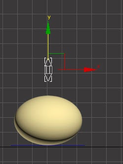
When the ball is falling it will also have it applied as it will become a bit thinner and longer as its falling, but this only applies to balls that will be at a quick speed and if they are light, a bowling ball for example wont have much of a different shape because it is a heavy ball with a lot of volume.
In this picture of a man kicking a ball you can see how the ball will slightly change shape, this is the anticipation taking effect just before the ball which change shape while its on the foot of the man who is kicking it, it will then squash out a little bit. This means that it will take back its original form of a hard round object.
Timing and Spacing.
This image shows timing and spacing, it has a timing of 20 frames and then the spacing shows how fast it will be the more, the bottom one is very robotic and has even spacing, and then if it has a large spacing between frames it is fast but then if it has a shorter spacing the animation will be slower.
Overlap and follow through.
Overlapping and follow through is something that is used in animation a lot. In the images below show what this principle is, it is something that gets used in items that swing like this ball on the string, the weight would have a certain effect, but in my animation the ball would be quite heavy so the exaggeration of the swing would be a lot, the timing of the drop has effect on realism so you need to make sure that it is all correct.
This diagram shows overlapping and follow through, one example is there the bar is the parent and the drag is the child, if the parent moves the child will drag behind but when the parent stops, the child will overlap and then when it s curves it depends on weight, then it shows how fast or slow it is.
The 7 images shows how from when the animation comes down the tail is behind at a high point and then when it stops the tail swings right to the opposite side with speed and then it will slowly stop before continuing along the course.
Anticipation.
Anticipation is something that is used in animation greatly, it is used in a moving object like this image of the ball bouncing round the obstacle course, the ball will use anticipation when it is about to jump up from the floor.
One example
This shows anticipation, in a image from a book, the anticipation is where the guy gets ready to jump and the movement he does just before he does jump, like when he kneels and the jumps up, so it uses timing as well as other components like squash and stretch.

There is anticipation in the golf swing, just before he connects with the ball the build up before when he swings it over his head and back around is the anticipation.
Staging.
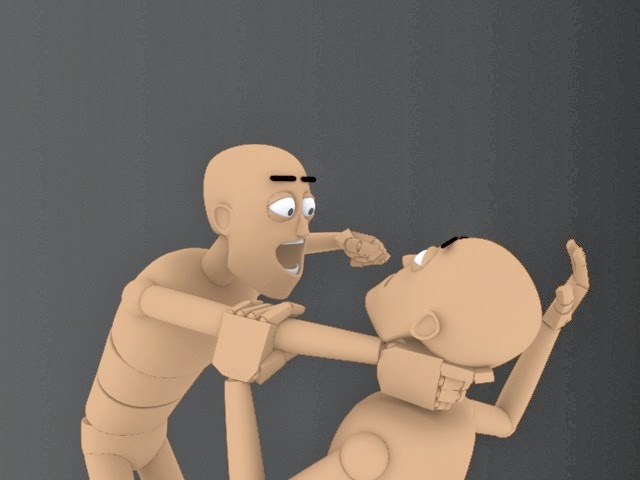 Staging is a presentation of an idea, it will include personality, and then the expressions of the character will represent a mood, in my image the mood is bad as the one man is getting strangled and being threatened while the other one is in pain and scared, you can see this clearly with the hard movements.
This image below shows us both the ways of staging, but one is bad and one is good. the one on the right which is poor staging is exactly that, poor staging, it is very limited as both characters are facing each other, so the you can't really see what emotions they have, but the on the right is a lot more open it shows you what emotion they have and from this you can see that one of them is happier while the other one is sadder, but the fact they are not front to front creates a more open vibe as you can see them a lot better.
This image shoes Mickey in colour and in a black silhouette. The colour image on its own is a strong image, but the black silhouette is also strong, you can see what is what. Mickey is a solid character silhouette because he ins't covering his face with his hands because if he did it wouldn't have the same effect.
Idle.
Idle is where an object will be stood still be will still have a slight animation to it, whether it be just a foot tap. The model can have a breather animation which gives the character personality instead of it being a dull dead still character when stood still.
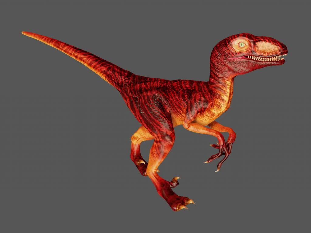
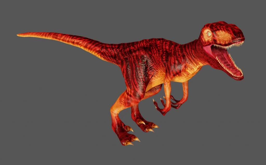
As you can see in these two images of the velociraptor, for example if this was the playable character and you was stood still, you may or could jump or stamp food on the ground, but the image below shows us that he may off roared and turned his head to the sides. This make the character seem real like there is life in the character even when you are not controlling him.
Walk Cycle.
My walk cycle is set at 64 frames, this then allows the walk motion to be able to be repeated and not look to fast. the frame set up is 0 - 16 - 32 as shows in the 3 images to the side and then the legs just other way round, but frame 0 and 64 will be the same frame so it can walk in a fluent motion.Walk cycles, a walk cycle has a frame limit set already in motion, they do it on the spot and do it not leave that spot where the character is set, they can be broken up into 4 key frames.
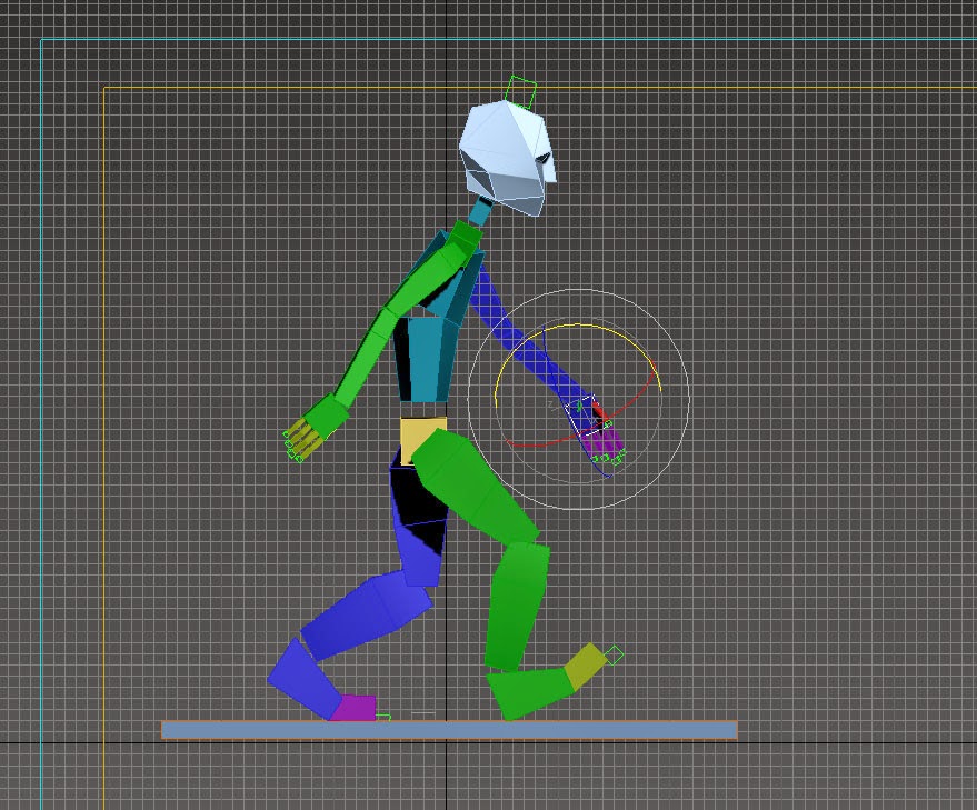
The walk cycle has so much going on at the same time, it used weight which uses follow through and overlapping action, the constant weight change creates the overlap from the waist. Then the arms will use follow through as the swing back and forth, this is because it is natural motion for characters to wing the arms in real life. So we do it in animation so it looks realistic. It also uses timing the timing is spaced out so that when one leg can push up the body to come back down so the other can follow through.
When walking, the arms will oppose the legs, so the arms will be behind and then a leg will be in front this is because of balance. When shifting weight between each leg you will always put all your weight on to one leg when walking this is because you cant have both legs in the air while moving, you need to shift from right to left to move forward. When you walk your head will slightly swing, very little though, you wont be like a bobble head. So when you walk your head will just jolt gently. The shoulders and the waist are opposite, for example when you stand still your weight will shift but then when you try to level out your torso will level out, your body shape will be odd and look weird.
Slow in/Slow out
Slow in and slow out, in life everything is moving forward or in some direction, every movement we make is a smooth fluent movement, it flows and there are not quick harsh snapping in real life so why make animation so that? real life smooth movement is captured in animation because it has a realistic feel to it.
Mechanical animation (animating a mech or robot) = no ease in or out
Slow in and slow out works by the main frames which are your key frames, they get added in frames before and after so that the movement can flow and then it allows you to see the poses you want.

The image above is a image of a ball on some string or rope. It is the perfect image for describing slow in and slow out. It shows us that when the ball is going slower there is more frames, so just before it drops it is slightly slower but when it drops its quick and then does the same slow in on the other side.
Pose to pose

The pose to pose motion. It is something that some animators may use in 2D animation not so much 3D, the pose to pose is where each frame is drawn and that creates an animation which has more of a flow about it. It is what it says it is, its one frame straight to the other frame.
Straight through animation looks smoother and is usually used in action scenes. Pose to pose makes great use of key frames to ensure the timing of the animation is correct.
Other ways of frame to frame is, where there will be the 3 main frames, do frame 1, 5 and 10 could all be the important frames and then they add the other frames in around those frames it gives the animation a sense of more realism as they are all added up on same lines and don't have as much freedom as the frame by frame way of drawing.
Arc
This is the step known as arcs, it is something that most natural action tend to follow. It is an arched trajectory, it is something that has a realism involved in it, This can apply to mechanical objects but not as much as it would to a limb moving on a rotating joint.
My animation course is of a bouncing ball which has a bit of weight added to it, you can see the trajectory line fall flat straight down but when it jumps up it creates an arc, this is at the bottom on the screen when the ball jumps up to jump across to the other side, and then the arc for that big jump is in the center.
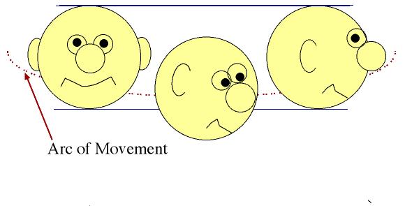

Even head turns have arcs, the image above shows that, your head does not turn in a straight line as that looks very robotic, the second image, with the straight lines is incorrect, but the one above with the curved line is correct as your head will tilt slightly as it is more realistic.
it is a natural motion which most things in life follow. If it was a 2D animation the artist would sketch a light outline on the paper, this is so that for example if a finger was pointing, it could follow the tow extreme poses.
Exaggeration
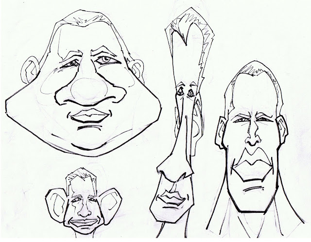
Exaggeration is something that has been around in animation for quite a while, it is something that can be used wrongly, it is something regularly occurs in animation. The top image of the faces is exaggeration you can see all types of stretch and squashed face even though they are not correct.They try and help people understand a
scene which may be happening, this is because the animation is trying to stand out, its trying to be bold and forward. You can see the image of the two men carrying an object, the one on the left is a correct pose, it is not over exaggerated it isn't trying to much, the one on the right is exaggerated you can see that just in the way he is stood. It is not like real life which is more like the left one, the right slightly exaggerated one is bold and out there in compared to the unexaggerated one.
This is two balls from one of my animations one is slightly exaggerated and one unexaggerated. The one on the right is exaggeration in it, and this gives the object a sense of weight, which a ball would have, but the other ball which has no stretch on it, this looks unreal as ball don't just stay perfect shape all the way through the air.
Dying Animation.
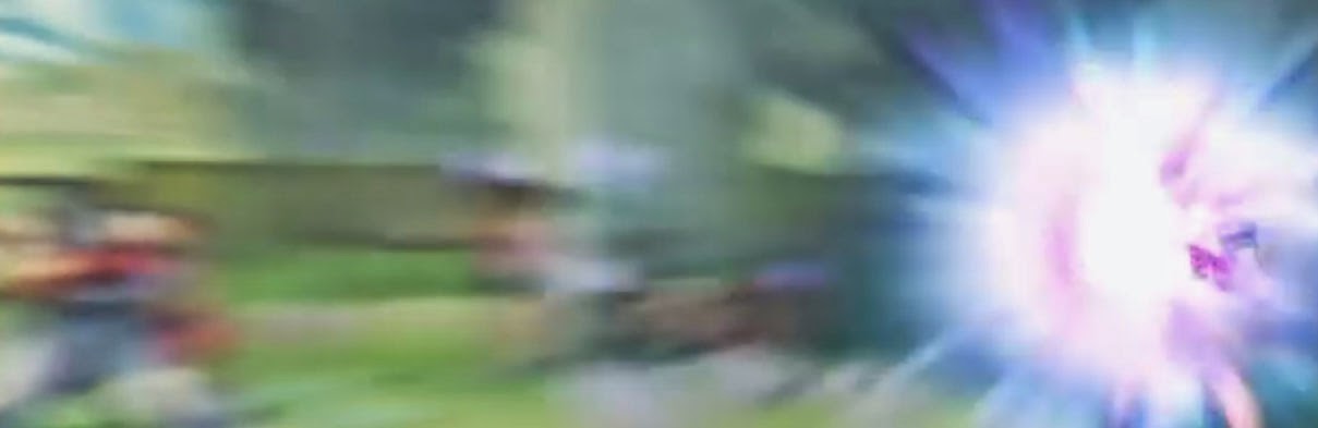
This animation is an enemy being shot away with a force power, the still shots of street fighter show us how the animation looks like at a pro level compared to mine.
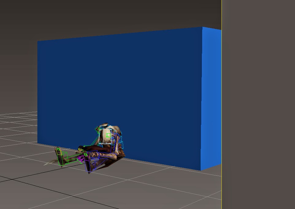
The animation uses anticipation, and it is just before the character gets fired back into the wall. It also uses Arcs, and this normally means, it has a natural arched trajectory, but in mine it is a short fly back, so the character only fly's in a straight line until he hits the wall and hits the floor.
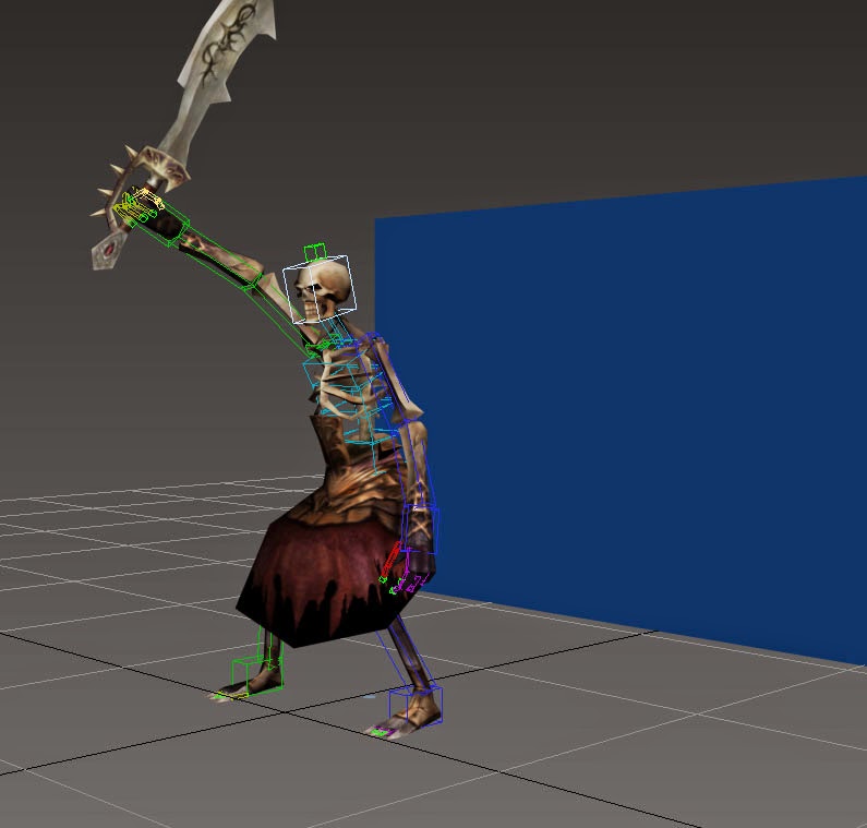
Killing Animation.
This is my killing animation, it uses a couple of the 12 principles, it uses timing as when the character swings the sword he swings it and then when it hits the ground, he needs to bend his knee's and then uses slow in and slow out, but its really it being a fast swipe and then slow out as he lifts the sword slower because it has some weight to it.
The killing animation uses all kinds on animation, it uses squash and stretch, like when he is holding the sword and when he swings down is is squashed down before he picks it back up, it also uses anticipation before he swings the sword around when it hits the floor and when picks it back up also and then swings across to then carry it back down, but when the sword is swung, there is a arc which is created, it is an organic swing of the arms, up to down.
Secondary animation
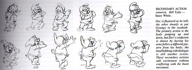
Secondary animation is something that is a plus to the primary animation for example if a character is talking to the camera or to another character. Then the the guy talking may use his hand to scratch his forehead or itch his eye, but this shouldn't be something that you take notice off, if you take notice of it, it has been done wrong. The animation adds expression and emotion to a character, but like I said you don't want to be something you take notice off because it will shadow the primary animation so it is important that you make sure that the primary animation is correct and is everything that you want it to be.
Appeal

Appeal in animation is something that is rather crucial, if a character is has a good appeal, it is a character that is appealing to the eye, its nice to look at and watch and you don't really mind if he is on the screen as he looks correct and smooth. Then a character which has a bad appeal won't be liked because it will have awkward outlines or misshaped features like a head. The example of the character Shrek on the left is a character which has a good appeal, this is because of the features and how everything is in proportion. The other one on the right has a bad appeal especially compared to the one on the left, the character has a weird shaped head and wouldn't be very nice to constantly watch in a film for example because of the way he is designed and uneven features.

The Joker from the Batman comics and films, this image is from the comics but even though he is a bad character and Batman's worst enemy, you like to watch the character because he has been designed well, he is a character which is appealing to watch. The character design has one effect, but then it allows a story to flow.
Solid Drawing
Solid drawing is something that an artist would take serious, this is because it is something that is needed, solid drawing is something that takes three-dimensional space, giving them volume and weight. The animator needs to be able to understand anatomy, 3D shapes, weight, balance, shadow and light etc. All these things need to be taken into account when animating especially if it is traditional. One thing which the original creators(Ollie Johnston and Frank Thomas) of the twelve principles believed was that characters should not be created as "twins" This is because characters would less life like.
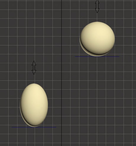
Take my bouncing ball animation as an example; The ball is squashed when it hits the floor, I had the ball squash by 10% in the Z axis. To keep the ball true to its mass I then needed to stretch the ball by 5% in both the Y and X axis. This is keeping the form of the ball the same throughout and therefore applying 'solid drawing'

 Another iconic platformer was Super Mario Bros(Nintendo). which was out on the NES and it was released in 1985, Super Mario Bros. was a game which had a lot of hidden gems hidden within the game. As you continue down levels the levels normally have secret hidden items that you can look for, this gives a sense of exploration. Super Mario Bros. was on the NES and with the NESif you was to make a game for this console you would need to get in touch with Nintendo before being able to start developing one and this means that Nintendo had license protection, and then Nintendo would test the games before releasing them. The strange thing is, that you was only able to make 5 games for the NES. When the NES was released it came with a gun and then ROB which was a small robot, it was also marketed as an entertainment system. With Mario it gives you a high score going through each level but Golden Axe never did even though similar style, especially as they are both platformer games, but with Super Mario Bros. The character changes size when find mushroom. The visuals of most early platform games are similar as they are bright and colourful. Even though the very early games were actually black and white with a gel screen in front of them which made them appear to be colour. The music can vary from the different styles of games. This link is to Super Mario Bros.
 Jurassic Park : Rampage edition was released on the Sega Mega Drive in 1994 and it was an action based platformer, the whole level design was tropical and had a distinct vibrant colour theme, It has bright blues and greens which have been related to the film which was based on a tropical island. The HUD design can relate to Prince of Persia in a sense as it only has a health and power bar at the top left hand corner which powers up when you kill enemies. This can be related to all games as most games incorporate this special power idea when you do certain stuff on a level. Other visual content was character and enemies which had a darker look to them, in the game there was only a few different enemies, weather it be a dinosaurs or a soldier. When you fight it only gives you a couple of options as the Sega Mega Drive only had a few buttons to push as shown in this image.


