What is Concept Art?
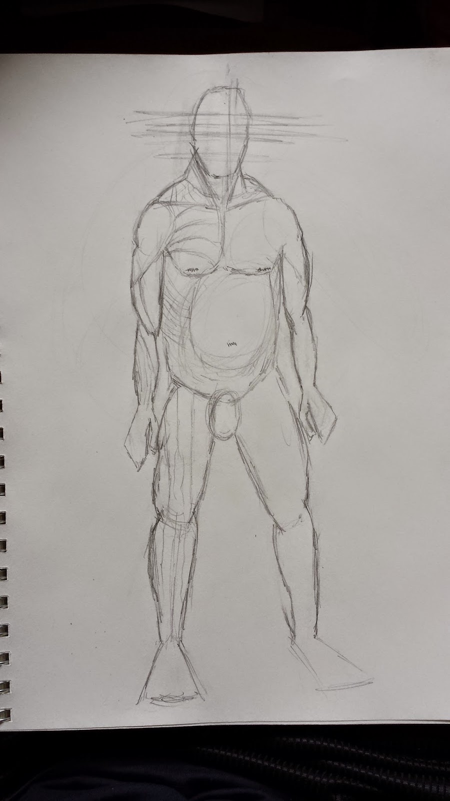
To become a concept artist you need know not only the basics, but you need to go to life drawing classes so you can understand the underline form or a human being. You need to know about human anatomy, for example you can not create a beautiful piece of work where a character has a huge set of arms which hit ground especially if they are a human. Then again even if it did have long arms and a shorty torso and stumpy legs and head, the character would still use the human anatomy like clavicles etc.


As you can see with piece of concept art, the orc still uses a human anatomy source with the traps leading up to the back of the neck, so even though it is not a human the basic idea from the beginning would of been a human skeleton just formed to a different shape.
Some concept artists have other back grounds which includes coming from a illustration background, you can come from an illustration background from children books as it can give you a different look because you have done stylized work before, or even comic book drawings which are cell-shaded with that deep black outline of characters etc.


 As you can see concept art can come from other backgrounds not just one area of studying and then going into it from education. So all concept artists will have there own unique style as many have come from different areas of art, some come from traditional drawing with pencil and paper, or from drawing story boards from films or comics. The visual library is something that all concept artists will know about. As a student, watching experienced concept artists such as Feng Zhu, it is clear they draw from instinct. This instinct is developed through a broad understanding of life and a large visual library built up over years of reading, visiting museums, watching documentaries and experiencing different cultures.These sights and sounds are held in the visual library and used when needed. This visual library will grow from an early age, playing with toys and games as a child will help with original and "cool" designs as an adult.For example, an artist who creates a beautiful piece of art such as a huge alien based tower which can have loads of different details like spirals and spikes on, for example Feng Zhu mentions that when he visited the Eiffel tower, you can actually see the size of the iron and metal which holds it up, so it gives you a sense of how strong and tough the metal needs to be to hold up that huge structure, you can also actually see how far you as you look down so that can give you an idea about how far up you actually are. This gives you the sense of how tall a large building should be especially when you stand next to it and look up. so all of these ideas can help create a piece of art.

Concept art has a history which has been around from the early 1930’s which Disney animation used to create characters and scenarios. This is a pre-production design role which is needed to create the game ideas in artwork form. Concept art is used for ideas and images of how a game will look; it is used for characters, item or area. So the main objective for concept artists is to create a visual still image of a scenario. They are used to design items such as guns, for example the Gears of War franchise used an artist to spread around a logo which was designed by their lead designer and then the concept artist would create this in a couple of different ideas of how it could look. These artists aren't just used to draw and create images they help on the design team until the project reaches the end for the drawing a creative side, concept artists must be able to work deadlines in capacity of a graphic designer. Concept artists don’t always just use paper and pencil to start off, more advanced ideas have been used with using software like Photoshop and Corral Painter; this is easily available for artists. They would also use a graphics tablet to draw an image on Photoshop for example.
Other techniques like oil paints, acrylic paints, markers have been used, but now modern paint packages have been programmed to simulate the use of blending the colours.
To become a concept artist you need know not only the basics, but you need to go to life drawing classes so you can understand the underline form or a human being. You need to know about human anatomy, for example you can not create a beautiful piece of work where a character has a huge set of arms which hit ground especially if they are a human. Then again even if it did have long arms and a shorty torso and stumpy legs and head, the character would still use the human anatomy like clavicles etc.
As you can see with piece of concept art, the orc still uses a human anatomy source with the traps leading up to the back of the neck, so even though it is not a human the basic idea from the beginning would of been a human skeleton just formed to a different shape.
Some concept artists have other back grounds which includes coming from a illustration background, you can come from an illustration background from children books as it can give you a different look because you have done stylized work before, or even comic book drawings which are cell-shaded with that deep black outline of characters etc.
As you can see concept art can come from other backgrounds not just one area of studying and then going into it from education. So all concept artists will have there own unique style as many have come from different areas of art, some come from traditional drawing with pencil and paper, or from drawing story boards from films or comics. The visual library is something that all concept artists will know about. As a student, watching experienced concept artists such as Feng Zhu, it is clear they draw from instinct. This instinct is developed through a broad understanding of life and a large visual library built up over years of reading, visiting museums, watching documentaries and experiencing different cultures.These sights and sounds are held in the visual library and used when needed. This visual library will grow from an early age, playing with toys and games as a child will help with original and "cool" designs as an adult.For example, an artist who creates a beautiful piece of art such as a huge alien based tower which can have loads of different details like spirals and spikes on, for example Feng Zhu mentions that when he visited the Eiffel tower, you can actually see the size of the iron and metal which holds it up, so it gives you a sense of how strong and tough the metal needs to be to hold up that huge structure, you can also actually see how far you as you look down so that can give you an idea about how far up you actually are. This gives you the sense of how tall a large building should be especially when you stand next to it and look up. so all of these ideas can help create a piece of art.
Concept art has a history which has been around from the early 1930’s which Disney animation used to create characters and scenarios. This is a pre-production design role which is needed to create the game ideas in artwork form. Concept art is used for ideas and images of how a game will look; it is used for characters, item or area. So the main objective for concept artists is to create a visual still image of a scenario. They are used to design items such as guns, for example the Gears of War franchise used an artist to spread around a logo which was designed by their lead designer and then the concept artist would create this in a couple of different ideas of how it could look. These artists aren't just used to draw and create images they help on the design team until the project reaches the end for the drawing a creative side, concept artists must be able to work deadlines in capacity of a graphic designer. Concept artists don’t always just use paper and pencil to start off, more advanced ideas have been used with using software like Photoshop and Corral Painter; this is easily available for artists. They would also use a graphics tablet to draw an image on Photoshop for example.
As you can see with piece of concept art, the orc still uses a human anatomy source with the traps leading up to the back of the neck, so even though it is not a human the basic idea from the beginning would of been a human skeleton just formed to a different shape.
Some concept artists have other back grounds which includes coming from a illustration background, you can come from an illustration background from children books as it can give you a different look because you have done stylized work before, or even comic book drawings which are cell-shaded with that deep black outline of characters etc.
Concept art has a history which has been around from the early 1930’s which Disney animation used to create characters and scenarios. This is a pre-production design role which is needed to create the game ideas in artwork form. Concept art is used for ideas and images of how a game will look; it is used for characters, item or area. So the main objective for concept artists is to create a visual still image of a scenario. They are used to design items such as guns, for example the Gears of War franchise used an artist to spread around a logo which was designed by their lead designer and then the concept artist would create this in a couple of different ideas of how it could look. These artists aren't just used to draw and create images they help on the design team until the project reaches the end for the drawing a creative side, concept artists must be able to work deadlines in capacity of a graphic designer. Concept artists don’t always just use paper and pencil to start off, more advanced ideas have been used with using software like Photoshop and Corral Painter; this is easily available for artists. They would also use a graphics tablet to draw an image on Photoshop for example.
Other techniques like oil paints, acrylic paints, markers have been used, but now modern paint packages have been programmed to simulate the use of blending the colours.
Concept art has changed through themes. They have been used to create the look of how science fiction and fantasy stuff could look like, but overall concept art has had many subjects in which is the involvement in films and games, but recently it has been a big thing for video games development, this is because it’s a different way to portrait how something would look. The different range in concept art has different views, especially from photo realistic to the traditional styles of painting. With the use of new software it has changed because artists can edit images pixel by pixel and this has given them the choice to use natural paint on a computer to imitate real paint. Concept artists have to create a lot of work in the early stages of work to show different interpretations, which are done in sketches, speed paints and 3d over paints but later when concept art is created they would use matte paint which is then used to give a realistic view which would be required.
But what concept art is actually used for is to create a view of an image, this is then done in a few different styles and looks, they would design the scenes that are in the game like walls and the floor of a building for example, they would create a few different looks of it and then the 3D modeler would create it in 3D. They also have to create an item which needs to have a specific look, which the game designer would show him what he wanted it to look like.
Their job includes to get the majority of their work to 100% because they give the main look to a game, they might create their own textures so that the world has its unique look and feel, especially since it has been hand drawn.
When creating concept art, it is good to have reference images to help you expand your brain because they need to be able to create a whole environment, so the role of a concept artist is hard and time consuming but without them games might look a bit different.
Composition
The first step is composition, all pieces of art have composition within them. One thing that you have to do is to make sure that you had made you drawing or photo interesting. It doesn't need bright fancy colours or heavy intense detail, you can make it interesting by just making sure that the image has rules. The rules are as follows.
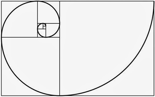
The Golden ratio, and this is a spiral which goes round the image and a lot of pieces of art use this. They use it because you're going to follow the the outline on a picture even though it is not there.
 You can see in this picture of the flower where your eye line will follow whether it be from the center to the outside or from the outside of the flower to the center.
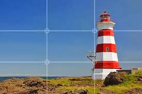
Another way of choosing a good use of composition is the rule of third, and this is used just as much as a lot of photos have this especially in maybe environment or landscape photos or drawings.

This is rule of third. The rule of third is this small grid which covers a image and the main points are where they cross in the middle.
The 4 points are useful in drawings as shown in this image of the wasp. The two main points on the right where the wasp is, is where you pay attention.
In a lot of images it will have a horizon line and this can sit at the bottom or even in between.
You can see the horizon line in this photo, which is the edge of the ground and sea just behind it. The photo has been taken there for a reason not by accident.

 This beach photo is to explain another rule which is called the Diagonal rule, you can see in this photo that you are supposed to follow the beach line where the sea and beach meet.
This image shows you where your eye will automatically follow, you will start from the bottom left and follow it all the way to the top right.
 This is S-Line and the purpose is to have you follow the road line which takes you to the end on the photo, you can also see the horizon line in the background of this image. This shows the the rule of third has been also used in this photo as it is above the top line on the rule of third grid.
 The triangle rule is where if an image has a lot of stuff in it they will all be close together and you will glide across each other the interesting points. The points in this image is the car on the left and then the house in the middle and then the car on the right and back to the previous car on the left.

This is the rule known as the frame, and this type of art or photography is to make you look straight through the dark space into the light like if you was in a dark tunnel. in this image you are looking through the woods towards the buildings in the background.
This image shows you where your eye will automatically follow, you will start from the bottom left and follow it all the way to the top right.
Understand Perspective
Perspective is something that is used in art, photography and among many things. Perspective is used because it can create an illusion of depth which gives 2D images a sense of realism.

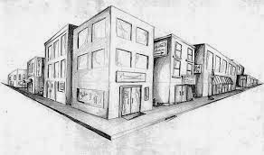
These three images are what perspective is. 1, 2, and 3 are the 3 main types of perspective views that people will use in the images that they draw.
1 point perspective is the top image, it is 1 point perspective because the point which you follow is the end of the road which your eye will follow.
 The second image is 2 point, this is 2 point because the angles go off in 2 different directions unlike the first image which only goes on in 1 direction.
The third image is a 3 point perspective, this is image is 3 point because its goes off into 3 different directions, to the sides and to the bottom of the buildings.
Perspective is something that is used in art, photography and among many things. Perspective is used because it can create an illusion of depth which gives 2D images a sense of realism.
These three images are what perspective is. 1, 2, and 3 are the 3 main types of perspective views that people will use in the images that they draw.
1 point perspective is the top image, it is 1 point perspective because the point which you follow is the end of the road which your eye will follow.
The third image is a 3 point perspective, this is image is 3 point because its goes off into 3 different directions, to the sides and to the bottom of the buildings.
Tonal value and light and shadows
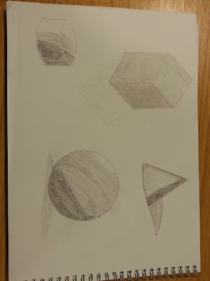
Light and shadows are created by light and darkness, when an object has light aimed on it it will create darkness on the opposite side. You can then see the light and dark as the sketches show, and tone allows you to see certain textures within an object.

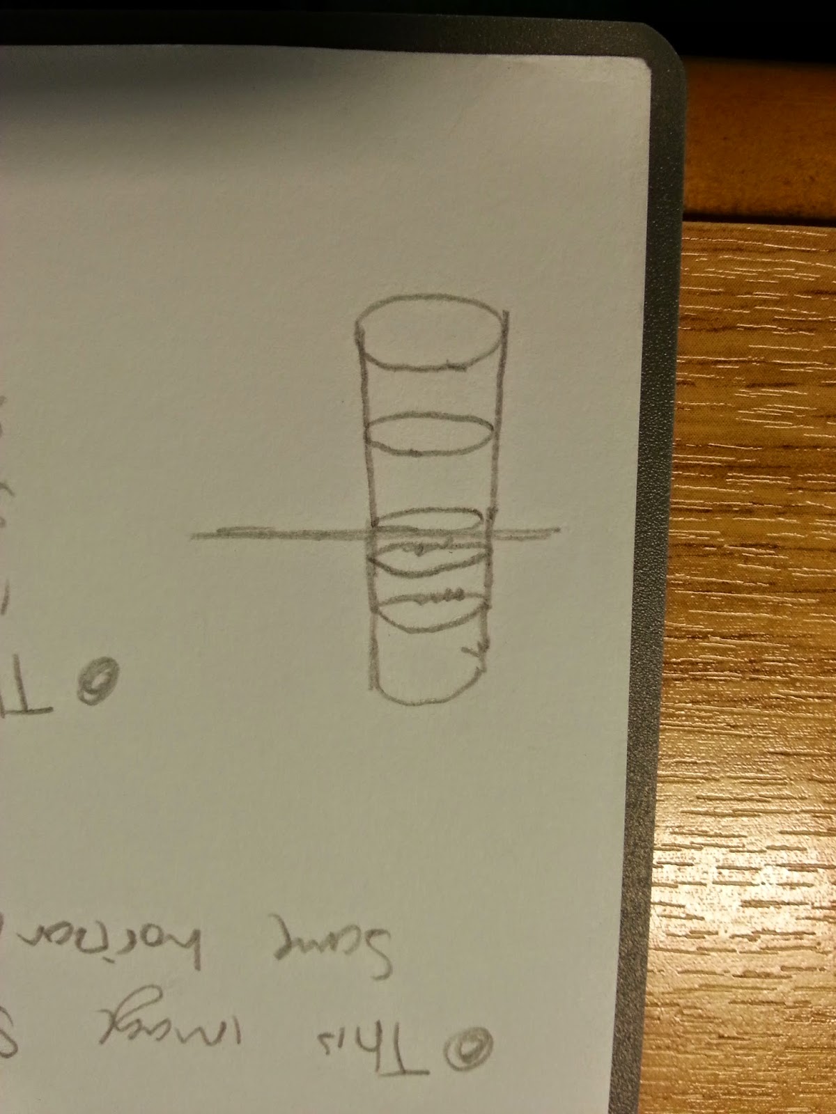
This is tone, tone is something that is created by an object and a light, for example if you take a brick and cast light on to it, it will create a shadow. like so in my sketch of a triangle which has had a light source aimed at it from one side and then that created the shadow.


Light and shadows are created by light and darkness, when an object has light aimed on it it will create darkness on the opposite side. You can then see the light and dark as the sketches show, and tone allows you to see certain textures within an object.
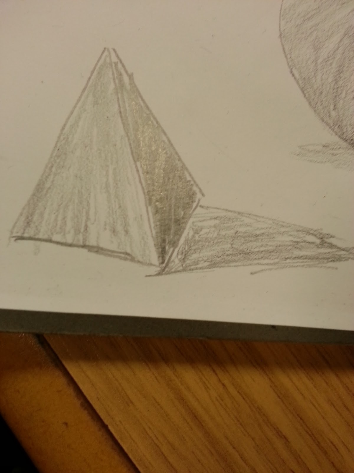
This is tone, tone is something that is created by an object and a light, for example if you take a brick and cast light on to it, it will create a shadow. like so in my sketch of a triangle which has had a light source aimed at it from one side and then that created the shadow.
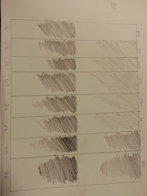
The definition of tone is where a degree of lightness and darkness are, tone can varies from bright white to the shades of grey and then to the deepest dark black shadows. the tone can depend on how the light touches the surface of the object and what the objects texture, colour and background is.
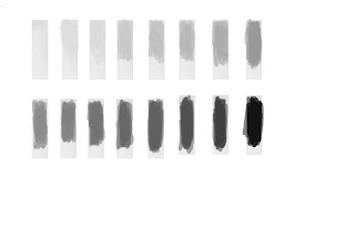
This demonstrates a spectrum of tone, this shows us how it goes from light to dark.
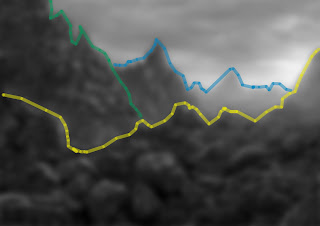
This image shows us that there are up to 4 different tone values. When you squint you can pick out the 4 different tones, I have leveled off the 4 different areas with colour so that it is easier to notice the change in tonal value.
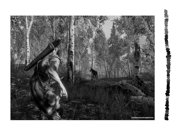
 You can see the colour tone in this game play shot of Skyrim, the colour theme is very neutral with browns and greens, but they have been darkened. The black and white version of the image shows us what is closer and what is further away, you can see that far in the distance is blurred trees which is normal as it is seen like this in the real world, grey is further away and and black is close, you can see all of the different types of grey and black at the side which show us that there is a huge amount of tone in the different shades are darkness.

This demonstrates a spectrum of tone, this shows us how it goes from light to dark.

This image shows us that there are up to 4 different tone values. When you squint you can pick out the 4 different tones, I have leveled off the 4 different areas with colour so that it is easier to notice the change in tonal value.

Colour Theory
 This is colour theory, This colour wheel shows us the primary colours which are red, blue and yellow, it also shows us what colours they make when mixed together, for example red and yellow can make a bright orange or a darker tone of yellow. Complimentary colours are where two colours work together, the red and the green are both complimentary colours this means that they both work well together.
 This triangle shows us in another style how you can make certain colours like green which is from blue and yellow.
 Colour theory is something that comes into play especially when creating pieces of art work. One point which comes into play is tertiary colours, tertiary is where if you add black and white to any of the colours on the colour wheel, you would get brown.


Here are two different games which would of used two different colour pallets.

This is my piece of art of some fish, you can see the colour difference from dark to light in a very simple fashion, the cross hatching shows us that it has a smooth textured skin and the colours of it bring it to life.

Here are two different games which would of used two different colour pallets.
This is my piece of art of some fish, you can see the colour difference from dark to light in a very simple fashion, the cross hatching shows us that it has a smooth textured skin and the colours of it bring it to life.
This is my piece of art of some fish, you can see the colour difference from dark to light in a very simple fashion, the cross hatching shows us that it has a smooth textured skin and the colours of it bring it to life.
Silent hill

Spyro
These two games are known well through out the games world, the first game I have chosen is Silent Hill, and the colours for this game are dark and tertiary colours, so there is a lot of browns and other dark tones, and the lighting and shadows create a even more dark atmosphere, then you have Spyro, it is a very bright open world with vibrant colours like purple, greens, blues etc. they create an atmosphere of friendly and happy which is quite the opposite of Silent hill.
Art Work and Drawings
Linear Drawing of Scale & Perspective

This picture explains how angles are proportional correct.
observed architectural interiors that are drawn can be hard, but with the correct spamming and looking at negative space as I have done you can achieve it.


The horizon/eye line, you can get tight angles on boxes or other objects or even rooms and buildings. They can become harder to draw.
 This could be a street with the same houses down each side, the images which show vanishing points from an eye line view
These two images are from Piranesi, they are interior design images, you can see that the arch in the back ground of the first picture is the vanishing point.

piranesi

 This image shows the same horizon line/eye line, The cylindrical image is the same as the square/cube are.
Leonardo Da Vinci's last supper. This uses a single vanishing point correctly, if you follow the floor lines this go straight to Jesus head
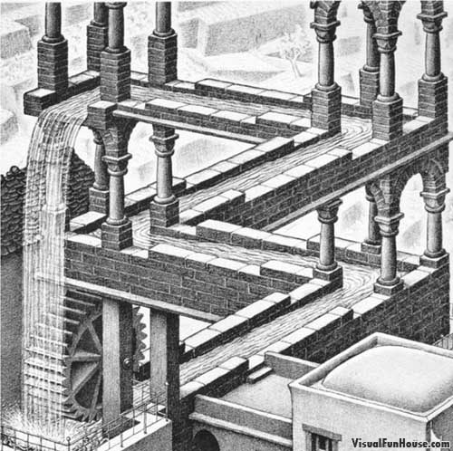 escher
This image is by Escher and it uses the same principal, but it has a trick of the eye in it, It is the water fall point which goes past the corner. That feeds the water to the background to resupply it to the foreground.
Linear Drawing of Textured Forms

The white highlights show up so much more because it is on a dark background, you can see hits of red in the fur and you'll notice, the hairs in a good manor.

This image is a picture from Alberecht Durer and its his famous study of turf and the hair and it is over 500 years old.
durer
This image is of a garden glove that I did, and It has a textured effect off dirt and old leather and suede.
You can see the texture in the bright orange area, this enhances the way it looks because of the roughness and the dirty area.

 Durer's drawings show us that how a single painting can look like a photo. The rabbit looks realistic especially with all the fur. This painting of the bird wing has strong colour design and is vibrant and this still looks the same after 500 years just like the the rabbit painting.
Geometrical Analysis of Underlying Form

This image is off my revolver picture, it shows us a close up of the barrel, and it gives us a view of how the gun looks using its underlying form.

This gun shows us its underlying form, the black lines are like the skeleton of the object.

This train also has a wireframe which is know as C.A.D. its the bit behind the fancy texture.
Introduction to life Drawing
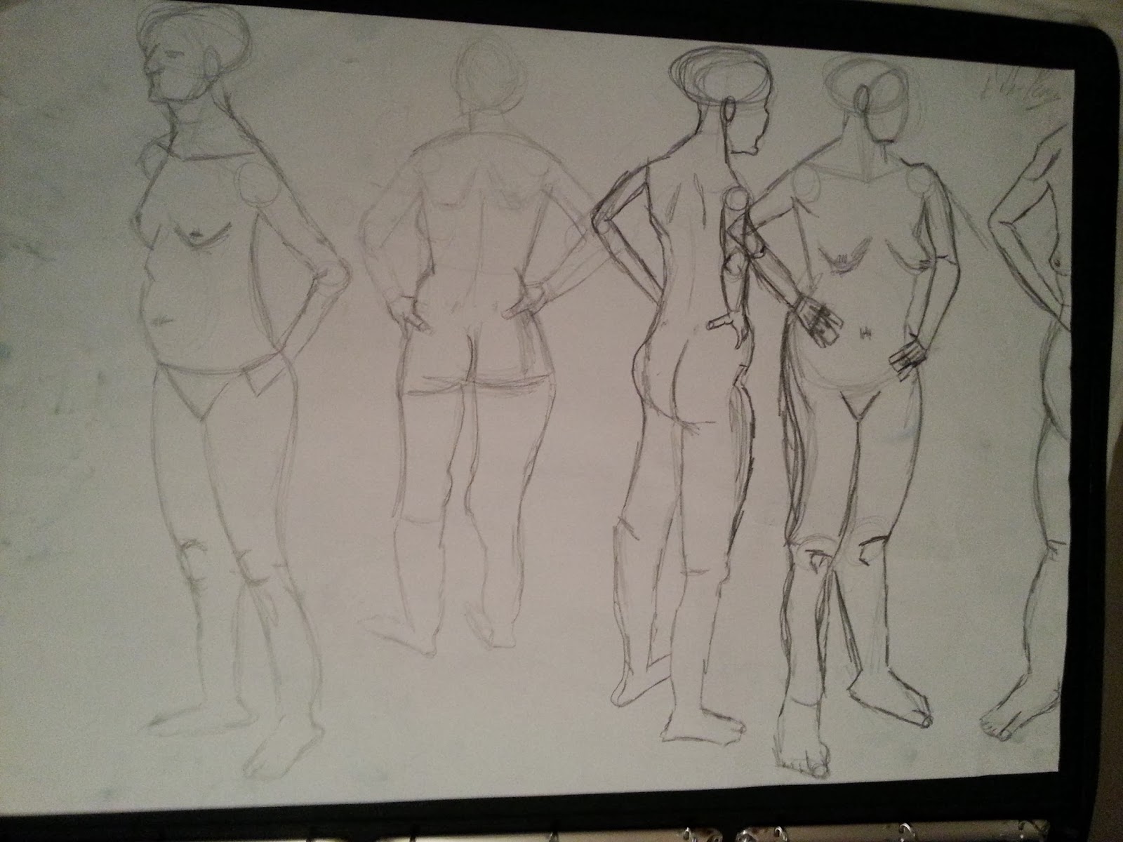
This is my life drawing section, this is a vital part of being able to draw, you need to learn the human anatomy to be able to draw people correctly. The estimated measurements of the human body is roughly 8 heads on top of each other. With learning life drawing it allows you to be able to draw characters in detail, for example if you had to come up with some rough sketches you would come back on previous art work that you have done and the life drawing would be your knowledge on how a character would look and stand.

As a perspective drawing, with a figure and boxes you need to make sure that the eye level is correct and that the figure interacts with the spatial environment. I think that i was successful.

This is art work from Giacometti and you can see how my art work and his are very similar. The perspective of the figures and the boxes are very much the same. The figure is dead in the centre of the piece of art and then the boxes surround the figure and there are all different heights of the objects, this allows you to see how tall the character is.
As a sculptor you can see his interest in a wire frame work of substructure, (like scaffolding).
Jeno Barcsay

This piece of art work is from Jeno Barcsay and he is know for doing stuff based on the human anatomy, if you compare the my life drawing art to the piece of art which shows us the anatomy you can see that my art uses it very well and the arms for example are a good size in comparison to the body.


These two drawings are objective studies of the human body, this means that is scientific because it is measured.

 Da Vinci

This is my piece of art which uses line drawing well, they are both small pieces of art and they show perspective in the human body.
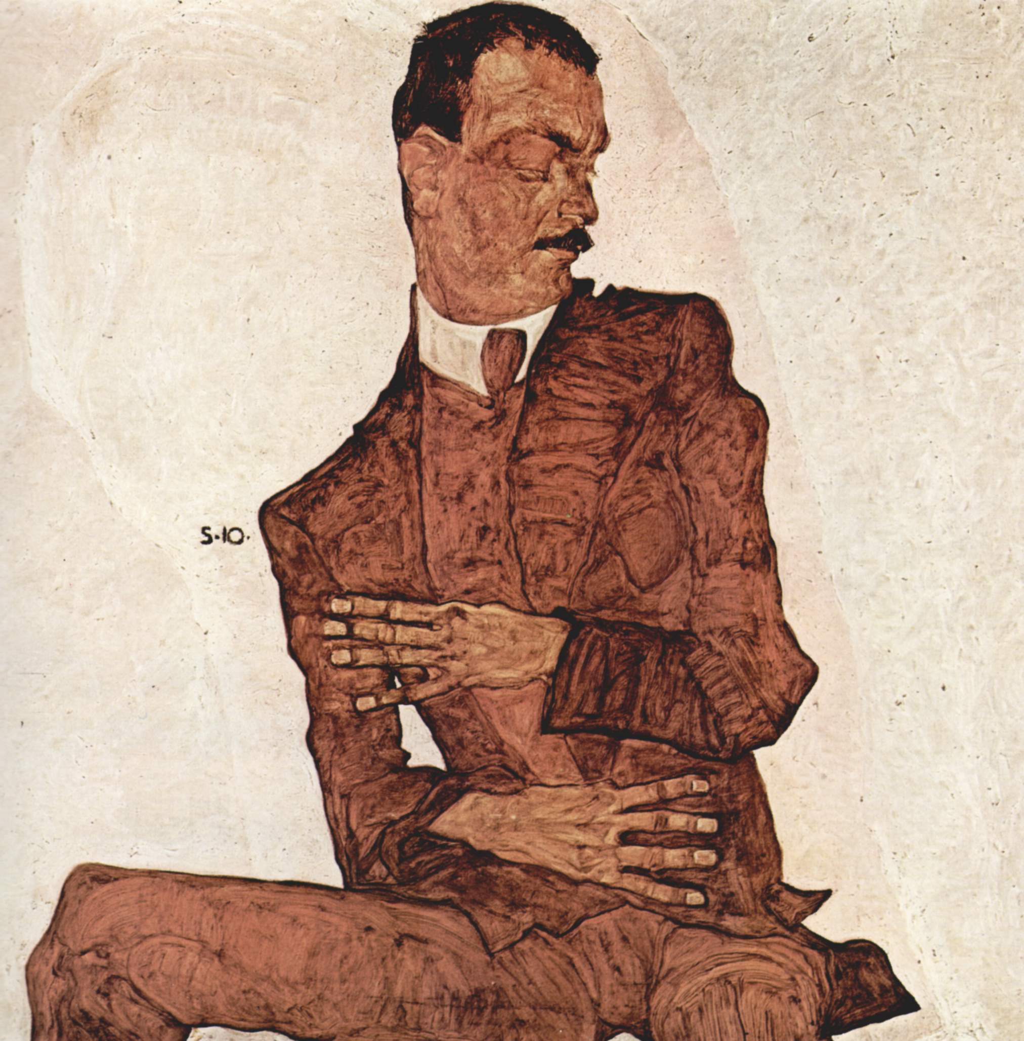
Egon Schiele is known widely for his skill in doing life drawing, he is one of his famous pieces of art. He is very into bony characters, he is mainly into skin and bone. He doesn't use much colour in his art either. He does very graphic line drawings which have no tone.

 Egon Schiele

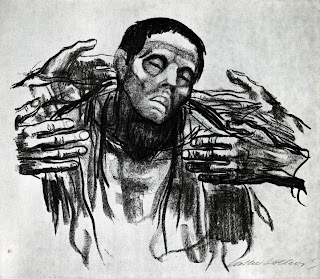 Kathe Kollwitz

She was an artist, that was around in the early 20th century, she was drawing a lot of skinny figures and portraits because that was normal then unlike today where people are a lot bigger. It represents the time era.

Henry Moore's hands, they are are very similar to kollwitz, but not so extemely bony, they arn't as harsh, they are slightly calmer. Its a picture which is looks like someone could be in meditation or praying, as usual he circumnavigates human form with wire volumetric lines,
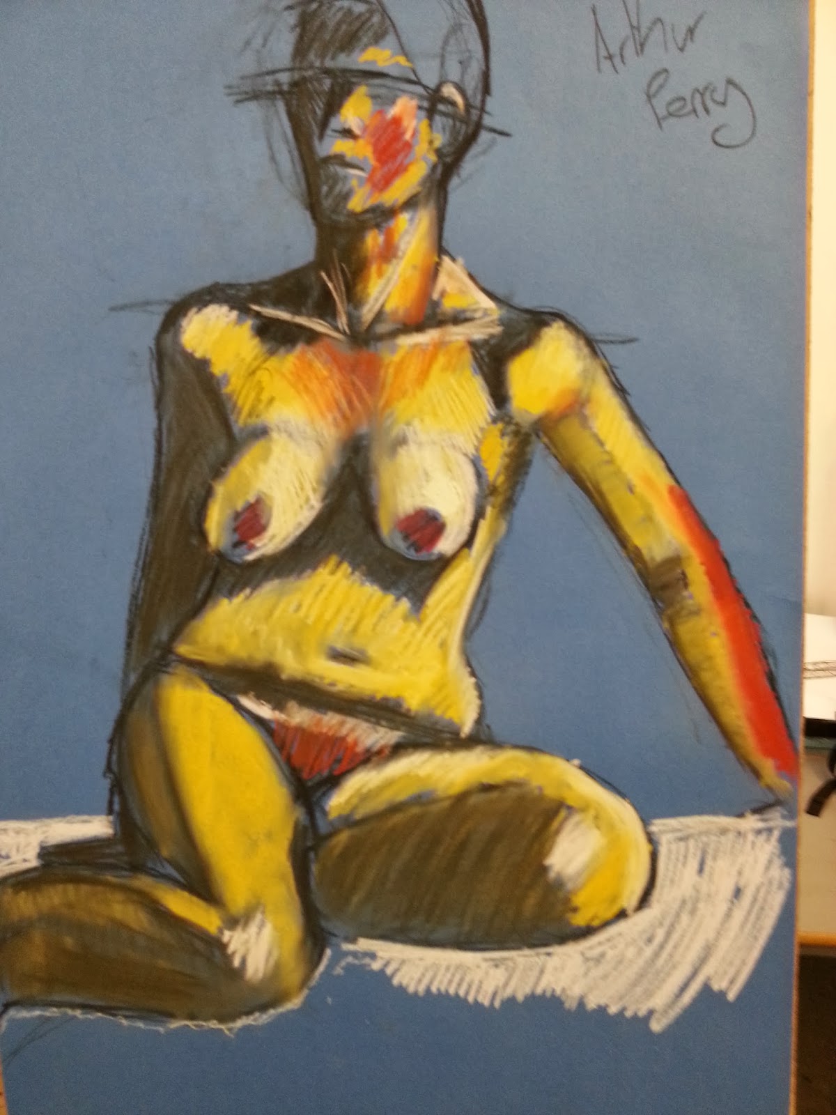
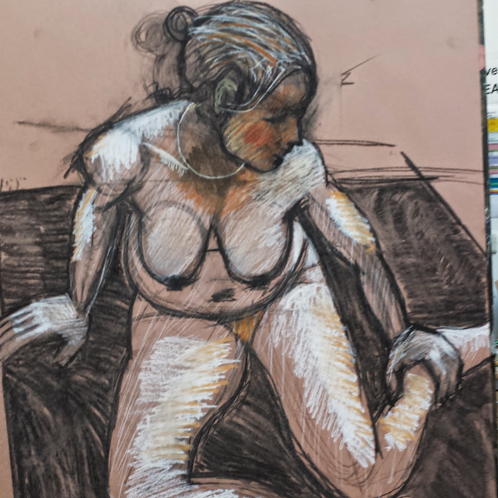
This drawing is off a women, it has a vast usage of colours, the blue background and then the cast of light on top of the background where the women is siting. Then the yellows, reds and oranges bring the foreground out.
This picture that I have drawn is of man laying down....
Rapid Drawing
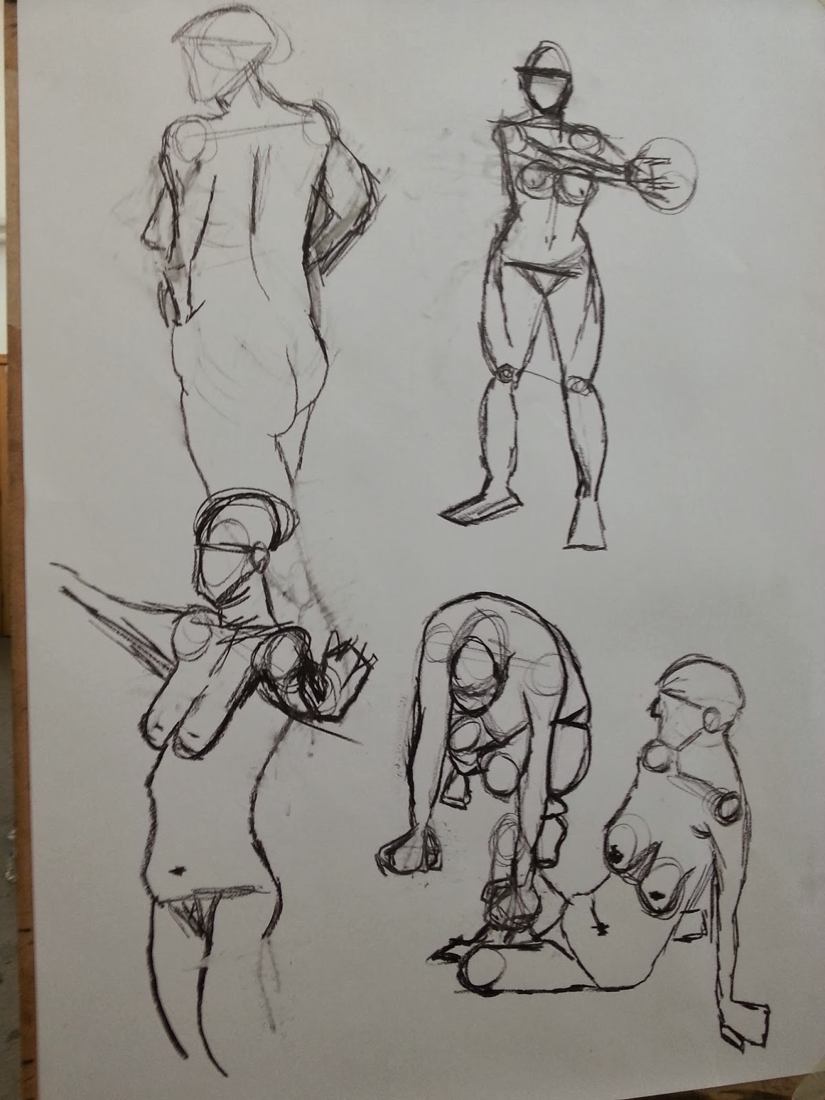
This is rapid drawing and this is something that I have done to quickly capture different angles from a figure, the first image shows us that the figure is moving at each shot with different body parts drawn like side view to the front and back.
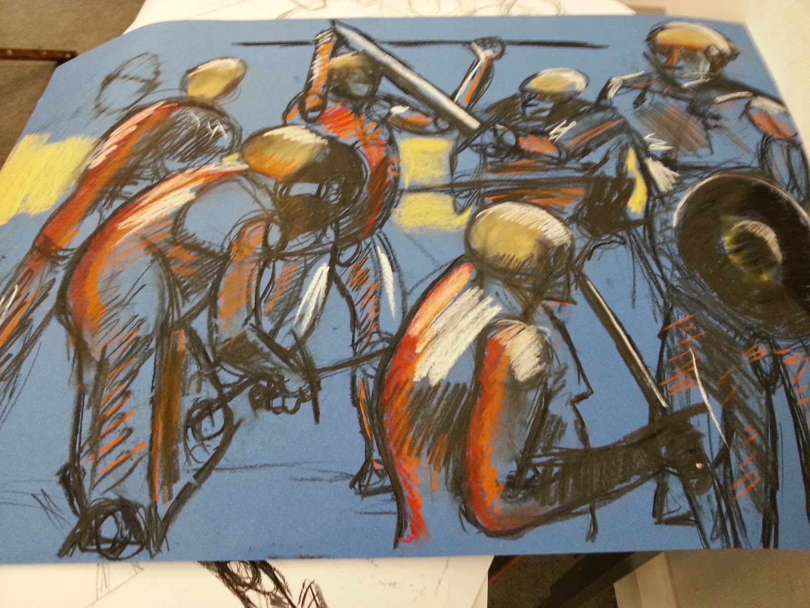
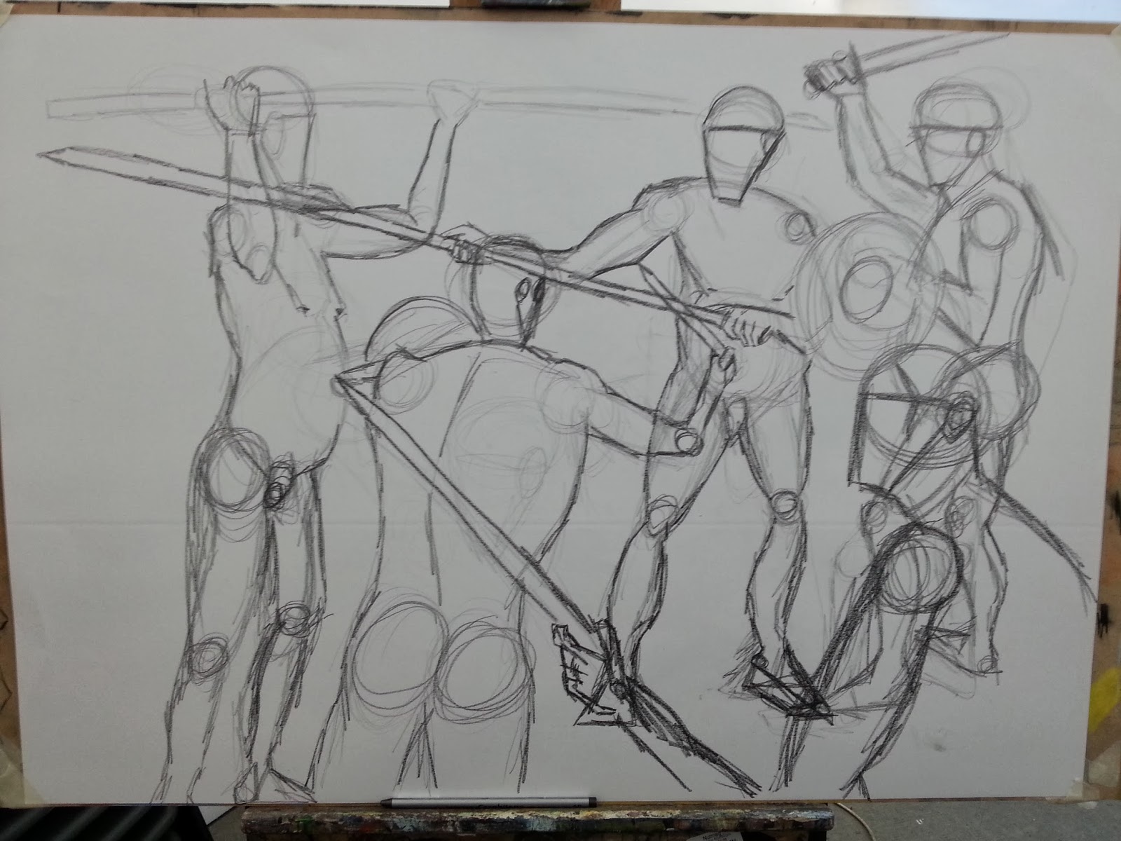
This is rapid drawing where i create a combat scene with interaction and It has the overlapping poses. I think it worked well and it created an exciting piece of art which could be used in concept visualization.
It is blue paper which was a dark colour, and I used warm colours which brought it out and created depth, then I added a direction of light and a chiaroscuro effect.


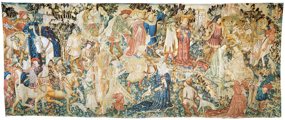
Bayeux Tapestry and the Trajan Column, these are both pieces are art which are either drawn on fabric or carved on stone. They are like old comic book strips, they tell a story. They have captured fast poses and have a lot of overlapped figures.

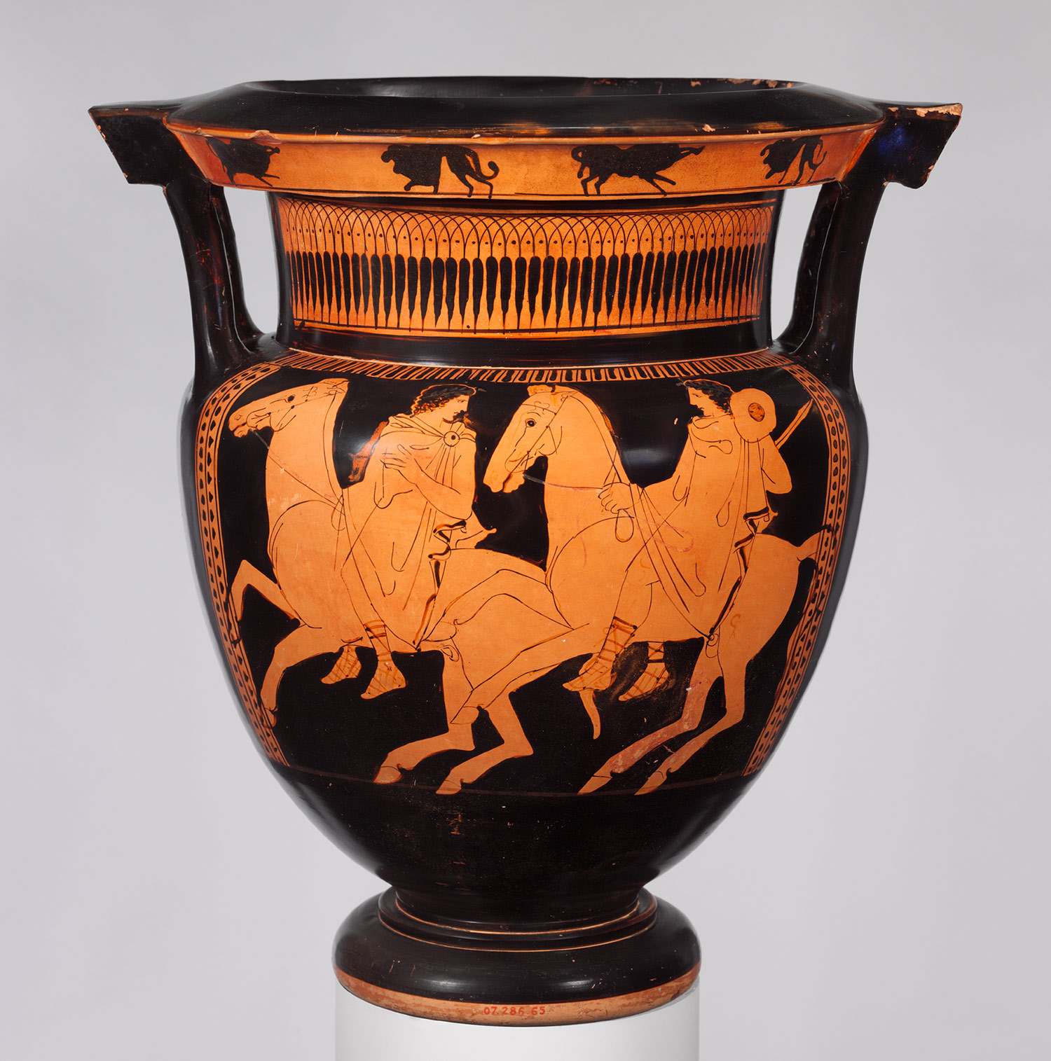
This is a Greek vase and the art that is on it would be done in a rapid motion.
This piece of art is some rapid drawing sketches you can see the circles which are round the shoulders and back side. There is a lot of overlay.
Volumetric Drawing
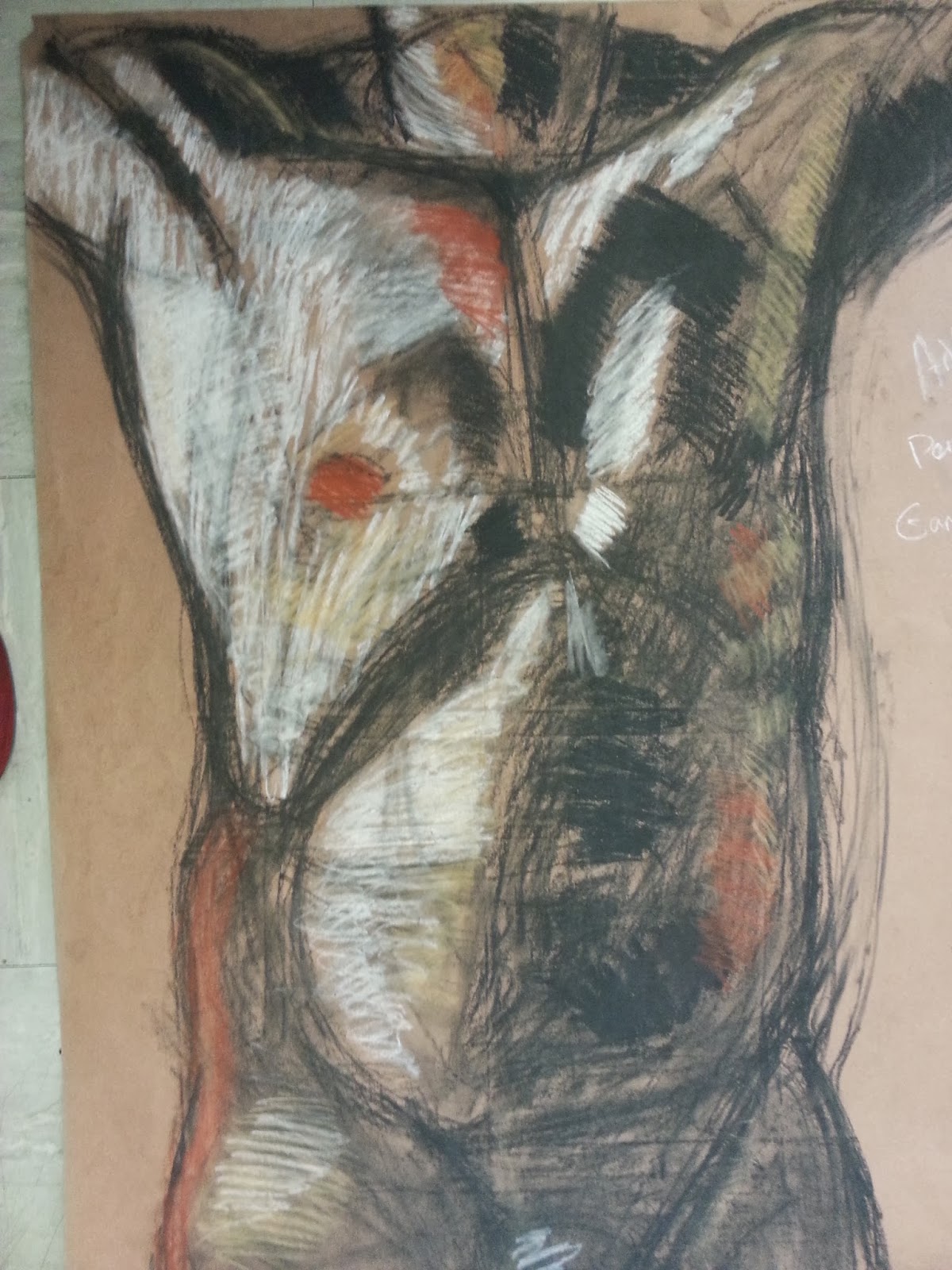
This is my piece of art of someones torso, you can see a lot of overdrawing and with that i have added muscle on top before applying light and shade.

.jpg)
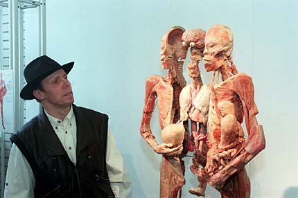
Gunther von hagen, he is an artist who i known for creating art with people that has passed away. it is good because it allows us to see the underlying form, we can see the structure of the bones and organs.
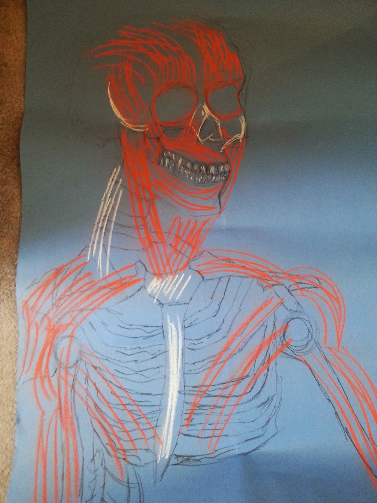
This is my piece of work that I have done, and you can see how similar it is to the work off Von Hagen, he is an artist which uses dead people as his art, he keeps them and skins them to show the underlying form of the flesh and skeleton.

This piece is is by Jeno Barcsay, he shows off the human anatomy well and you can see in my flesh and skeleton picture is has the same flesh states, the traps and round the deltoid muscle.
Observation of Strong Light & Shade on Figure
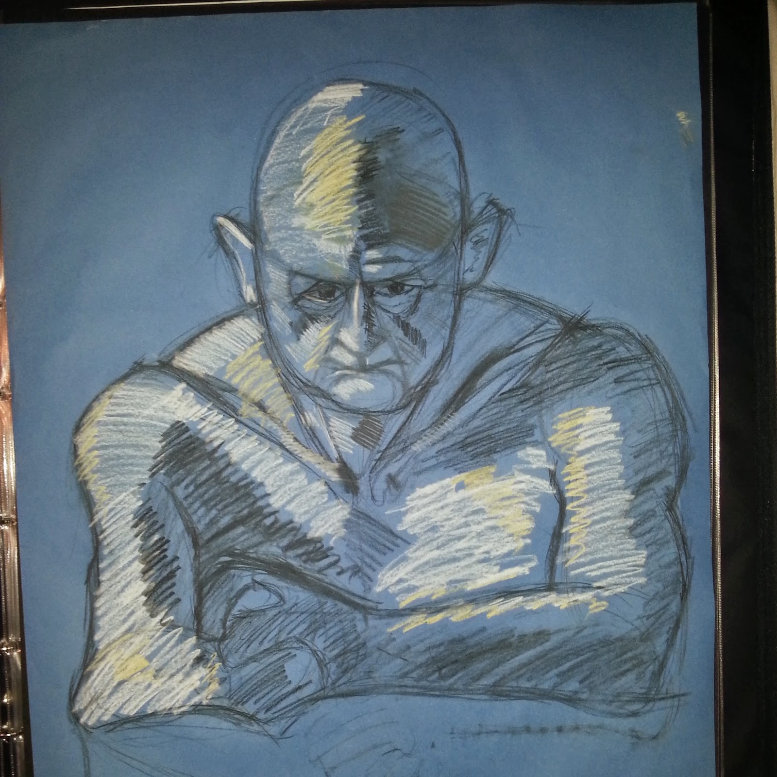
Light and shade are important in art, you can see on my piece of art, the portrait off the man uses light and dark shadow from a light and it creates depth in the skin, it is the same with the Kathe Kollwitz portrait, there is a lot of shadow and light used in the picture, the darkness round the eye and the hand really stands out as the rest of the picture is white.

Caravaggio
Caravaggio uses a lot of darkness in the image at the top, it is a piece which has one main light source from the left hand side and you can really see that, especially when it has contact with the darkness on the right hand side.
_-_The_Cardsharps_-_Google_Art_Project.jpg)
 degas pastel drawing
In degas pastel drawing, you can see the light and dark coming together, there is a lot of dark shade round the arm bit where the towel is, but there is bits near the knee cap where light hits the back of the leg.
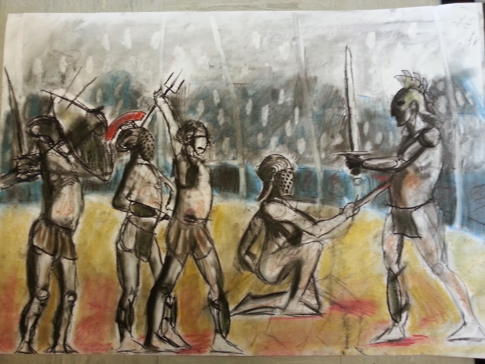
In my battleground picture you can see the light and dark very well, I think that this image works well because everything single back leg or back etc. has a hint of shade and tone, the darkness brings out the light which is coming from the right hand side of the picture. The colour balance is nice as you notice the floor is red and yellow with a slight orange in it. Then the blue round the outside really brings it to life with a slight 3d effect of being in a round arena.
This is my piece of art which uses light and darkness well, you can see the light source on the right shine down which then creates the dark tone on the left, the arm has the only hint of light on it as it is slightly higher then say the hand or round the hip.
Foreshortening & Elevation
This is my my section which is based on foreshortening and elevation, the first image has a lot of foreshortening in it, you can see in the arms and shoulder sections of the models that it has worked well, it looks realistic in a sense. The proportions look correct, there is a slight overlay of joints like shoulder and forearm to hand.
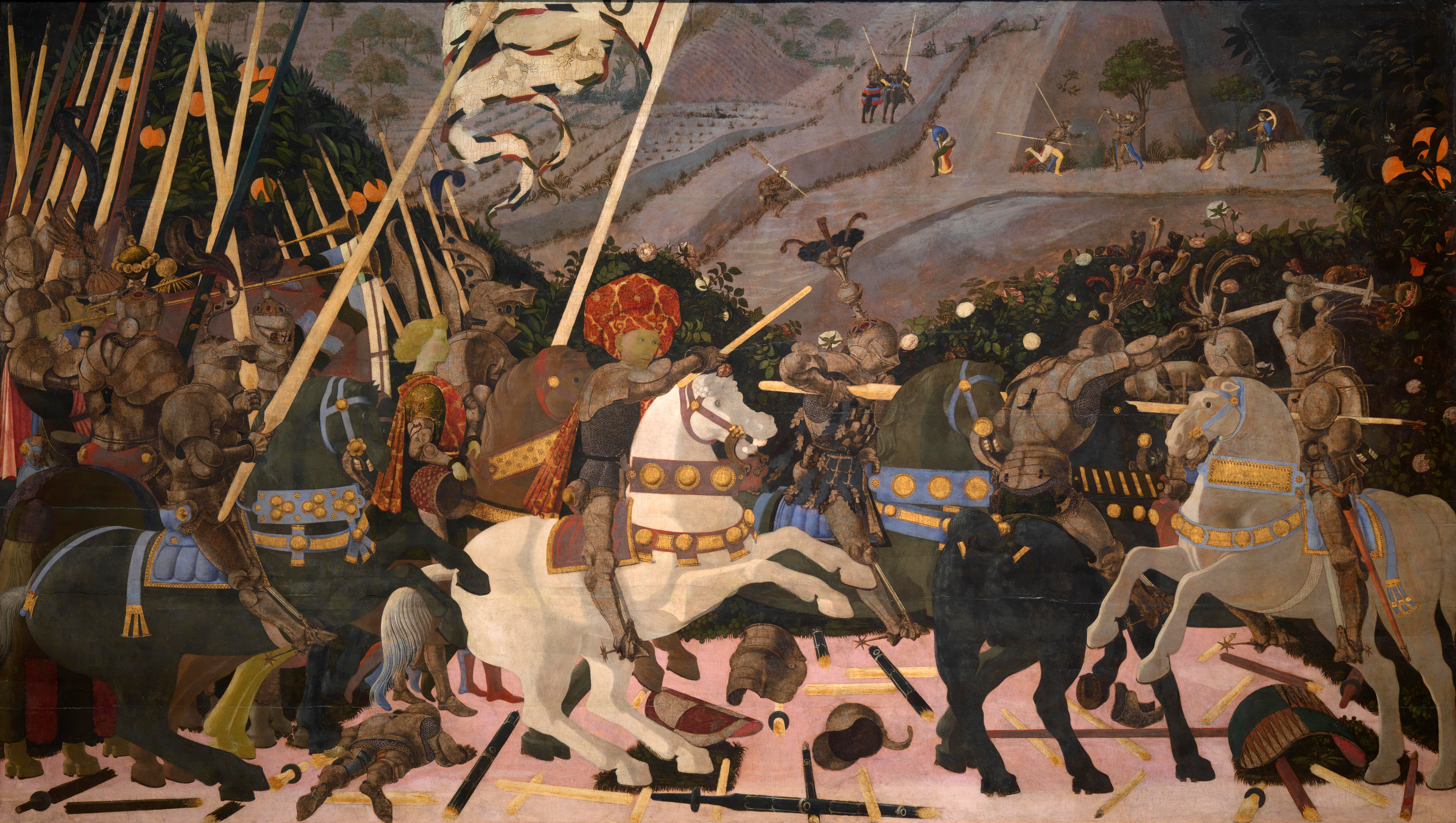 Uccello's Fallen figures in 'Battle of San Romano'
 Andrea Mantegna
Andrea Mantegna this is her picture known as 'Dead Christ' it has a similar look to my own image which is just below, apart from they are different sides of the body. They both have foreshortening in them.
These image is of a women which has a foreshorten arm, you can see it in the shoulder and the bicep.
Multi-view Observation & Clay Modeling
This is sculpting section which you can see the orc that I created,it has a human anatomy like the big deltoids and then big trapeziua(traps) they support the large head as they are quite big muscled creatures. It has a similar face structure to a human.
Even in the the sculpture has a triangle head, but it still has human features like nose, mouth etc.


This is Giacometti, and he is famous for the sculptures that he has done, he can capture the human form in metal and other raw materials. I think my sculpture of my orc reaches the quality of these in human anatomy wise.
Auguste Rodin, This is the famous kiss sculpture it shows the human form wrapped around the opposite sex in a good amount of detail and you can even see muscle definition, especially round the traps and rip cage on the women.
Personal Experimentation/Development

This is a picture of man in a pirate costume, and It took a long part of the day to complete and then with this I used different media types like paint, pencil and chalk etc. He is my best piece of work that I created by far.


This orc is is my final sculpture design and it is step by step in painting, I have done a good job in the mouth and finding details in the skin like veins etc. The eyes are my favorite part because it really brings it to life. We also had to create a menu for the game idea that we was creating. The game was called Mayhem, and you play as orc warlord, and you fight off scum from the woods who are crazy humans, but you defend your walls with other races like humans, it is a kinda drug problem that has made people become dark or it could be something to do with magic.
The menu design is something I could see in real life on a game, I reckon it works well with the theme and idea of the whole story.

I made sure that I used two different types of typography, this gives it a bit of character and it doesn't seem so boring. If it used same colour and font it would have a slight different appeal then this with two different exciting fonts.
Other bits of art work.


My orthographic shot of my character.
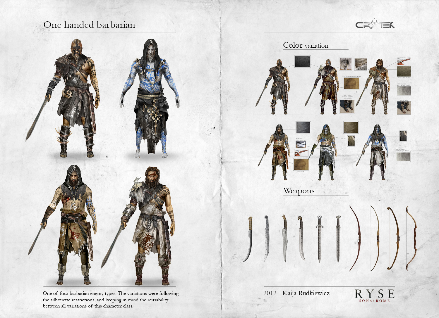

These are pieces of concept art from RYSE : son of Rome. as you can see they have different clothing looks and orthographic view which allows you to see what it looks like from different angles.


Concept art is something that is used in the game industry as it is a way that us as artists can easily portrait an idea, it is the drawing board which is the foundations of a game art style.
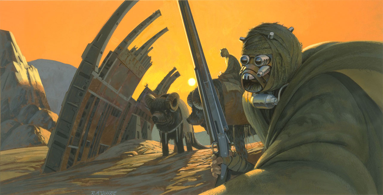

Star wars had loads and loads of concept art and with this, it was able to produce a lovely set of pre prodution work ready for the filming. Ralph Mcquarrie was a concept artist and illustrator who worked for Lucas Arts and his art work shaped some of the designs for the films that are released today.


Lucian Freud was a brilliant artist alone, as you can see in the images above, you can see the tone and detail he has put into every little bit of detail. My drawing below uses a similar principle as I have applied white highlights in the correct areas which means the light source would of been very bright and then darker bits would of been the darker tones or shadow.

Circum navigating in art is just as you see in this picture, the white line round the neck is a necklace but before you apply detail and shading, you need to block and navigate around the model and scale up the torso, legs etc. You do this by applying circles across the paper, so around the neck, belly, shoulders and to be fair, most of the body, it is easier to block it out if you circum navigate it
understanding line from
 look for quick line drawings from egon and his graphic line, life drawings in line


I choose this picture from Jenny Saville as it was similar shot to my line drawing in my sketchbook.


Jenny saville was an artist from Cambridge, and was known for her art, she did a lot of painting and some where known for being rather large people in paintings.


Line art is very basic just like the title, all you draw is black and very minor shading.
This is roman art and tapestries and as you can see the style of art that I have created is similar in the sense that it is a lot of characters in one image where they all overlay one and other. They can vary from a senate scene to a bloody battle.


These images of roman art tell us stories about people in high places and all kinds of tales which included war etc.


Tapestry is what a lot of people would of hanged on a wall to show off the art that they have had made or created and they do a similar thing in overlaying a lot of different parts of the scene.
Character concept ( the butcher )
Using super sculpy and metal, I created a large boss like game character.

I started off by creating an underline form, from using metal wire and then from there I twisted and turned to get this shape, so effectively it is like creating the bone form. Then I started to apply the super sculpy.

This is the first stage of adding the super sculpy, I created the model from covering the whole mesh with it and then from there you add the human from which is the muscles and structure underneath the skin.
This is the stage of where I started to struggle as I needed to sort out how the weight and balance.

 After making sure that I was happy with the body, I started to work on the face and then I used tools to scoop out eye sockets so that the eye balls could be placed in the skull. I gave the character that scary look to him, looks a bit like a ogre, or orc, which also give off a scary or negative vibe as they are dangerous.
After sorting the basics of the anatomy, body weight and head, I then moved onto the clothing of the model.
I created the top first, which is a granddad polo shirt, which is a top without a collar. Then I went onto creating the apron, and and then do forth down the body onto patchwork trousers. Then I added a hat on to finish it off before adding the weapon.


When I applied all the clothing I made sure that all of the clothes on the model had that realistic look to them, which was done by creating creases and tears in the cloth and clothes, the creases were easy to do as you can wrap the sculpy around the model to fit the size. So for example when I applied the shirt, I cut long strips and then you can fold the sculpy to have the stance of the model may be.
The cooking stage.

The cooking took up to 4 hours and with that I choose to add support at the back of the model so that when it cooked it doesn't fall in on itself which may happen if it isn't supported good enough.
Then after cooking you begin to clean the model with basic washing up liquid, then you can apply the paint to figure.


The paint stage.
The paint stage is something that is important to any model, form sculpy/clay to actual digital 3D work, As artists its our job to get the best out of what we create and then with the art style we need to choose the correct look and style, my character is realistic so I went for a realistic paint style.

When I finished all base layers I then gave the character highlights and little adaptations to the paint, so the chain mail glove was all silver, which had a dark tint to it and then I then went to procede with adding highlights with a slightly lighter silver.


When I finished the character I then added terrain to it, which was wooded floorboards, the characters background was that he lived in a factory so I think the wooded floorboards as it was a good basis for what could be in an abandoned warehouse or factory.


My butcher, the difference between the actual super sculpy and me doing it digitally, the digital version was id say a little harder as its slightly harder to change and manipulate. This is because the digital model has a number of faces and edges which need to be moved and then changed correctly, but then when it comes to the sculpture it is hard to change, but it is easier none the less as you can change the way the figure looks and feels.
Generally I think that the digital version was more difficult as sometimes digital stuff can cause problems like loss of work, or the deleting of bits of the character. Then you really can do anything to a physical model that sits in front of you.
The clothing was a lot more fun to do in the sculpture because it feels like you have a lot more free will in doing so, like the trousers on the sculpture had a patchwork effect which looked really nice and then when it come to the digital one it wasn't as great so I didn't go through with it.
We used super sculpy instead of WED clay which we used in the previous year. WED clay was a lot harder to use and manipulate as it dried a lot quicker then super sculpy. The super sculpy stayed soft and was easy to warm and and bend and change the shape.
Linear Drawing of Scale & Perspective
This picture explains how angles are proportional correct.
observed architectural interiors that are drawn can be hard, but with the correct spamming and looking at negative space as I have done you can achieve it.
The horizon/eye line, you can get tight angles on boxes or other objects or even rooms and buildings. They can become harder to draw.
This could be a street with the same houses down each side, the images which show vanishing points from an eye line view
These two images are from Piranesi, they are interior design images, you can see that the arch in the back ground of the first picture is the vanishing point.
piranesi
This image shows the same horizon line/eye line, The cylindrical image is the same as the square/cube are.
Leonardo Da Vinci's last supper. This uses a single vanishing point correctly, if you follow the floor lines this go straight to Jesus head
escher
This image is by Escher and it uses the same principal, but it has a trick of the eye in it, It is the water fall point which goes past the corner. That feeds the water to the background to resupply it to the foreground.
Linear Drawing of Textured Forms
The white highlights show up so much more because it is on a dark background, you can see hits of red in the fur and you'll notice, the hairs in a good manor.
This image is a picture from Alberecht Durer and its his famous study of turf and the hair and it is over 500 years old.
durer
This image is of a garden glove that I did, and It has a textured effect off dirt and old leather and suede.
You can see the texture in the bright orange area, this enhances the way it looks because of the roughness and the dirty area.
Durer's drawings show us that how a single painting can look like a photo. The rabbit looks realistic especially with all the fur. This painting of the bird wing has strong colour design and is vibrant and this still looks the same after 500 years just like the the rabbit painting.
Geometrical Analysis of Underlying Form
This image is off my revolver picture, it shows us a close up of the barrel, and it gives us a view of how the gun looks using its underlying form.
This gun shows us its underlying form, the black lines are like the skeleton of the object.
This train also has a wireframe which is know as C.A.D. its the bit behind the fancy texture.
Introduction to life Drawing
As a perspective drawing, with a figure and boxes you need to make sure that the eye level is correct and that the figure interacts with the spatial environment. I think that i was successful.
This is art work from Giacometti and you can see how my art work and his are very similar. The perspective of the figures and the boxes are very much the same. The figure is dead in the centre of the piece of art and then the boxes surround the figure and there are all different heights of the objects, this allows you to see how tall the character is.
As a sculptor you can see his interest in a wire frame work of substructure, (like scaffolding).
Jeno Barcsay
This piece of art work is from Jeno Barcsay and he is know for doing stuff based on the human anatomy, if you compare the my life drawing art to the piece of art which shows us the anatomy you can see that my art uses it very well and the arms for example are a good size in comparison to the body.
These two drawings are objective studies of the human body, this means that is scientific because it is measured.
Da Vinci
This is my piece of art which uses line drawing well, they are both small pieces of art and they show perspective in the human body.
These two drawings are objective studies of the human body, this means that is scientific because it is measured.
Da VinciThis is my piece of art which uses line drawing well, they are both small pieces of art and they show perspective in the human body.
Egon Schiele is known widely for his skill in doing life drawing, he is one of his famous pieces of art. He is very into bony characters, he is mainly into skin and bone. He doesn't use much colour in his art either. He does very graphic line drawings which have no tone.
Egon SchieleKathe Kollwitz
She was an artist, that was around in the early 20th century, she was drawing a lot of skinny figures and portraits because that was normal then unlike today where people are a lot bigger. It represents the time era.
Henry Moore's hands, they are are very similar to kollwitz, but not so extemely bony, they arn't as harsh, they are slightly calmer. Its a picture which is looks like someone could be in meditation or praying, as usual he circumnavigates human form with wire volumetric lines,
This drawing is off a women, it has a vast usage of colours, the blue background and then the cast of light on top of the background where the women is siting. Then the yellows, reds and oranges bring the foreground out.
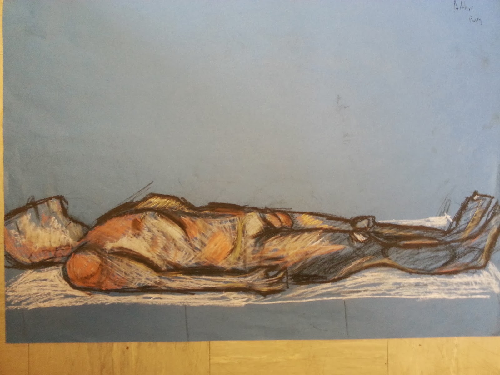
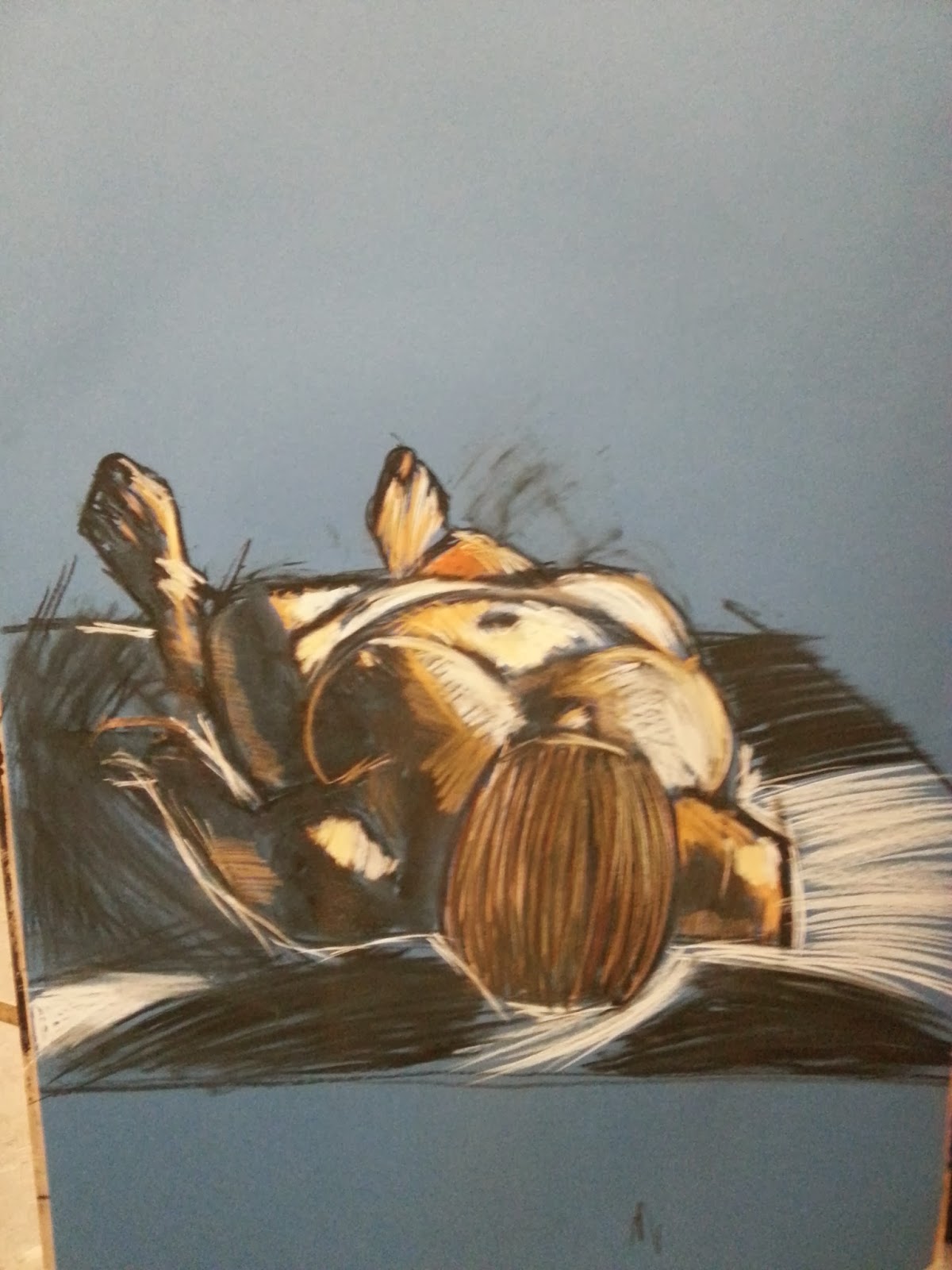
This picture that I have drawn is of man laying down....
Rapid Drawing
Henry Moore's hands, they are are very similar to kollwitz, but not so extemely bony, they arn't as harsh, they are slightly calmer. Its a picture which is looks like someone could be in meditation or praying, as usual he circumnavigates human form with wire volumetric lines,
This drawing is off a women, it has a vast usage of colours, the blue background and then the cast of light on top of the background where the women is siting. Then the yellows, reds and oranges bring the foreground out.
This picture that I have drawn is of man laying down....
Rapid Drawing
This is rapid drawing and this is something that I have done to quickly capture different angles from a figure, the first image shows us that the figure is moving at each shot with different body parts drawn like side view to the front and back.
This is rapid drawing where i create a combat scene with interaction and It has the overlapping poses. I think it worked well and it created an exciting piece of art which could be used in concept visualization.
It is blue paper which was a dark colour, and I used warm colours which brought it out and created depth, then I added a direction of light and a chiaroscuro effect.
Bayeux Tapestry and the Trajan Column, these are both pieces are art which are either drawn on fabric or carved on stone. They are like old comic book strips, they tell a story. They have captured fast poses and have a lot of overlapped figures.
This is a Greek vase and the art that is on it would be done in a rapid motion.
This piece of art is some rapid drawing sketches you can see the circles which are round the shoulders and back side. There is a lot of overlay.
Volumetric Drawing
This is my piece of art of someones torso, you can see a lot of overdrawing and with that i have added muscle on top before applying light and shade.
Gunther von hagen, he is an artist who i known for creating art with people that has passed away. it is good because it allows us to see the underlying form, we can see the structure of the bones and organs.
This is my piece of work that I have done, and you can see how similar it is to the work off Von Hagen, he is an artist which uses dead people as his art, he keeps them and skins them to show the underlying form of the flesh and skeleton.
This piece is is by Jeno Barcsay, he shows off the human anatomy well and you can see in my flesh and skeleton picture is has the same flesh states, the traps and round the deltoid muscle.
Observation of Strong Light & Shade on Figure
Light and shade are important in art, you can see on my piece of art, the portrait off the man uses light and dark shadow from a light and it creates depth in the skin, it is the same with the Kathe Kollwitz portrait, there is a lot of shadow and light used in the picture, the darkness round the eye and the hand really stands out as the rest of the picture is white.
Caravaggio
Caravaggio uses a lot of darkness in the image at the top, it is a piece which has one main light source from the left hand side and you can really see that, especially when it has contact with the darkness on the right hand side.
degas pastel drawing
In degas pastel drawing, you can see the light and dark coming together, there is a lot of dark shade round the arm bit where the towel is, but there is bits near the knee cap where light hits the back of the leg.
In my battleground picture you can see the light and dark very well, I think that this image works well because everything single back leg or back etc. has a hint of shade and tone, the darkness brings out the light which is coming from the right hand side of the picture. The colour balance is nice as you notice the floor is red and yellow with a slight orange in it. Then the blue round the outside really brings it to life with a slight 3d effect of being in a round arena.
This is my piece of art which uses light and darkness well, you can see the light source on the right shine down which then creates the dark tone on the left, the arm has the only hint of light on it as it is slightly higher then say the hand or round the hip.
Foreshortening & Elevation
This is my my section which is based on foreshortening and elevation, the first image has a lot of foreshortening in it, you can see in the arms and shoulder sections of the models that it has worked well, it looks realistic in a sense. The proportions look correct, there is a slight overlay of joints like shoulder and forearm to hand.
Uccello's Fallen figures in 'Battle of San Romano'
Andrea Mantegna
Andrea Mantegna this is her picture known as 'Dead Christ' it has a similar look to my own image which is just below, apart from they are different sides of the body. They both have foreshortening in them.
These image is of a women which has a foreshorten arm, you can see it in the shoulder and the bicep.
Multi-view Observation & Clay Modeling
This is sculpting section which you can see the orc that I created,it has a human anatomy like the big deltoids and then big trapeziua(traps) they support the large head as they are quite big muscled creatures. It has a similar face structure to a human.
Even in the the sculpture has a triangle head, but it still has human features like nose, mouth etc.
This piece of art is some rapid drawing sketches you can see the circles which are round the shoulders and back side. There is a lot of overlay.
Volumetric Drawing
This is my piece of art of someones torso, you can see a lot of overdrawing and with that i have added muscle on top before applying light and shade.
Volumetric Drawing
This is my piece of art of someones torso, you can see a lot of overdrawing and with that i have added muscle on top before applying light and shade.
Gunther von hagen, he is an artist who i known for creating art with people that has passed away. it is good because it allows us to see the underlying form, we can see the structure of the bones and organs.
This is my piece of work that I have done, and you can see how similar it is to the work off Von Hagen, he is an artist which uses dead people as his art, he keeps them and skins them to show the underlying form of the flesh and skeleton.
This piece is is by Jeno Barcsay, he shows off the human anatomy well and you can see in my flesh and skeleton picture is has the same flesh states, the traps and round the deltoid muscle.
Observation of Strong Light & Shade on Figure
Light and shade are important in art, you can see on my piece of art, the portrait off the man uses light and dark shadow from a light and it creates depth in the skin, it is the same with the Kathe Kollwitz portrait, there is a lot of shadow and light used in the picture, the darkness round the eye and the hand really stands out as the rest of the picture is white.
Caravaggio
Caravaggio uses a lot of darkness in the image at the top, it is a piece which has one main light source from the left hand side and you can really see that, especially when it has contact with the darkness on the right hand side.
degas pastel drawing
In degas pastel drawing, you can see the light and dark coming together, there is a lot of dark shade round the arm bit where the towel is, but there is bits near the knee cap where light hits the back of the leg.
In my battleground picture you can see the light and dark very well, I think that this image works well because everything single back leg or back etc. has a hint of shade and tone, the darkness brings out the light which is coming from the right hand side of the picture. The colour balance is nice as you notice the floor is red and yellow with a slight orange in it. Then the blue round the outside really brings it to life with a slight 3d effect of being in a round arena.
This is my piece of art which uses light and darkness well, you can see the light source on the right shine down which then creates the dark tone on the left, the arm has the only hint of light on it as it is slightly higher then say the hand or round the hip.
Foreshortening & Elevation
Gunther von hagen, he is an artist who i known for creating art with people that has passed away. it is good because it allows us to see the underlying form, we can see the structure of the bones and organs.
This is my piece of work that I have done, and you can see how similar it is to the work off Von Hagen, he is an artist which uses dead people as his art, he keeps them and skins them to show the underlying form of the flesh and skeleton.
Observation of Strong Light & Shade on Figure
Light and shade are important in art, you can see on my piece of art, the portrait off the man uses light and dark shadow from a light and it creates depth in the skin, it is the same with the Kathe Kollwitz portrait, there is a lot of shadow and light used in the picture, the darkness round the eye and the hand really stands out as the rest of the picture is white.
Caravaggio
Caravaggio uses a lot of darkness in the image at the top, it is a piece which has one main light source from the left hand side and you can really see that, especially when it has contact with the darkness on the right hand side.
degas pastel drawing
In degas pastel drawing, you can see the light and dark coming together, there is a lot of dark shade round the arm bit where the towel is, but there is bits near the knee cap where light hits the back of the leg.
Light and shade are important in art, you can see on my piece of art, the portrait off the man uses light and dark shadow from a light and it creates depth in the skin, it is the same with the Kathe Kollwitz portrait, there is a lot of shadow and light used in the picture, the darkness round the eye and the hand really stands out as the rest of the picture is white.
Caravaggio
Caravaggio uses a lot of darkness in the image at the top, it is a piece which has one main light source from the left hand side and you can really see that, especially when it has contact with the darkness on the right hand side.
degas pastel drawingIn degas pastel drawing, you can see the light and dark coming together, there is a lot of dark shade round the arm bit where the towel is, but there is bits near the knee cap where light hits the back of the leg.
In my battleground picture you can see the light and dark very well, I think that this image works well because everything single back leg or back etc. has a hint of shade and tone, the darkness brings out the light which is coming from the right hand side of the picture. The colour balance is nice as you notice the floor is red and yellow with a slight orange in it. Then the blue round the outside really brings it to life with a slight 3d effect of being in a round arena.
This is my piece of art which uses light and darkness well, you can see the light source on the right shine down which then creates the dark tone on the left, the arm has the only hint of light on it as it is slightly higher then say the hand or round the hip.
Foreshortening & Elevation
This is my my section which is based on foreshortening and elevation, the first image has a lot of foreshortening in it, you can see in the arms and shoulder sections of the models that it has worked well, it looks realistic in a sense. The proportions look correct, there is a slight overlay of joints like shoulder and forearm to hand.
Uccello's Fallen figures in 'Battle of San Romano'Andrea Mantegna
Andrea Mantegna this is her picture known as 'Dead Christ' it has a similar look to my own image which is just below, apart from they are different sides of the body. They both have foreshortening in them.
These image is of a women which has a foreshorten arm, you can see it in the shoulder and the bicep.
Multi-view Observation & Clay Modeling
Even in the the sculpture has a triangle head, but it still has human features like nose, mouth etc.
This is Giacometti, and he is famous for the sculptures that he has done, he can capture the human form in metal and other raw materials. I think my sculpture of my orc reaches the quality of these in human anatomy wise.
Auguste Rodin, This is the famous kiss sculpture it shows the human form wrapped around the opposite sex in a good amount of detail and you can even see muscle definition, especially round the traps and rip cage on the women.
Personal Experimentation/Development
This is a picture of man in a pirate costume, and It took a long part of the day to complete and then with this I used different media types like paint, pencil and chalk etc. He is my best piece of work that I created by far.
This orc is is my final sculpture design and it is step by step in painting, I have done a good job in the mouth and finding details in the skin like veins etc. The eyes are my favorite part because it really brings it to life. We also had to create a menu for the game idea that we was creating. The game was called Mayhem, and you play as orc warlord, and you fight off scum from the woods who are crazy humans, but you defend your walls with other races like humans, it is a kinda drug problem that has made people become dark or it could be something to do with magic.
The menu design is something I could see in real life on a game, I reckon it works well with the theme and idea of the whole story.
I made sure that I used two different types of typography, this gives it a bit of character and it doesn't seem so boring. If it used same colour and font it would have a slight different appeal then this with two different exciting fonts.
Other bits of art work.
My orthographic shot of my character.
These are pieces of concept art from RYSE : son of Rome. as you can see they have different clothing looks and orthographic view which allows you to see what it looks like from different angles.
Concept art is something that is used in the game industry as it is a way that us as artists can easily portrait an idea, it is the drawing board which is the foundations of a game art style.
Star wars had loads and loads of concept art and with this, it was able to produce a lovely set of pre prodution work ready for the filming. Ralph Mcquarrie was a concept artist and illustrator who worked for Lucas Arts and his art work shaped some of the designs for the films that are released today.
Lucian Freud was a brilliant artist alone, as you can see in the images above, you can see the tone and detail he has put into every little bit of detail. My drawing below uses a similar principle as I have applied white highlights in the correct areas which means the light source would of been very bright and then darker bits would of been the darker tones or shadow.
Circum navigating in art is just as you see in this picture, the white line round the neck is a necklace but before you apply detail and shading, you need to block and navigate around the model and scale up the torso, legs etc. You do this by applying circles across the paper, so around the neck, belly, shoulders and to be fair, most of the body, it is easier to block it out if you circum navigate it
understanding line from
I choose this picture from Jenny Saville as it was similar shot to my line drawing in my sketchbook.
Jenny saville was an artist from Cambridge, and was known for her art, she did a lot of painting and some where known for being rather large people in paintings.
Line art is very basic just like the title, all you draw is black and very minor shading.
This is roman art and tapestries and as you can see the style of art that I have created is similar in the sense that it is a lot of characters in one image where they all overlay one and other. They can vary from a senate scene to a bloody battle.
These images of roman art tell us stories about people in high places and all kinds of tales which included war etc.
Tapestry is what a lot of people would of hanged on a wall to show off the art that they have had made or created and they do a similar thing in overlaying a lot of different parts of the scene.
Character concept ( the butcher )
Using super sculpy and metal, I created a large boss like game character.
I started off by creating an underline form, from using metal wire and then from there I twisted and turned to get this shape, so effectively it is like creating the bone form. Then I started to apply the super sculpy.
This is the first stage of adding the super sculpy, I created the model from covering the whole mesh with it and then from there you add the human from which is the muscles and structure underneath the skin.
This is the stage of where I started to struggle as I needed to sort out how the weight and balance.
After making sure that I was happy with the body, I started to work on the face and then I used tools to scoop out eye sockets so that the eye balls could be placed in the skull. I gave the character that scary look to him, looks a bit like a ogre, or orc, which also give off a scary or negative vibe as they are dangerous.
After sorting the basics of the anatomy, body weight and head, I then moved onto the clothing of the model.
I created the top first, which is a granddad polo shirt, which is a top without a collar. Then I went onto creating the apron, and and then do forth down the body onto patchwork trousers. Then I added a hat on to finish it off before adding the weapon.
When I applied all the clothing I made sure that all of the clothes on the model had that realistic look to them, which was done by creating creases and tears in the cloth and clothes, the creases were easy to do as you can wrap the sculpy around the model to fit the size. So for example when I applied the shirt, I cut long strips and then you can fold the sculpy to have the stance of the model may be.
The cooking stage.
The cooking took up to 4 hours and with that I choose to add support at the back of the model so that when it cooked it doesn't fall in on itself which may happen if it isn't supported good enough.
Then after cooking you begin to clean the model with basic washing up liquid, then you can apply the paint to figure.
The paint stage.
The paint stage is something that is important to any model, form sculpy/clay to actual digital 3D work, As artists its our job to get the best out of what we create and then with the art style we need to choose the correct look and style, my character is realistic so I went for a realistic paint style.
This is the stage of where I started to struggle as I needed to sort out how the weight and balance.
After making sure that I was happy with the body, I started to work on the face and then I used tools to scoop out eye sockets so that the eye balls could be placed in the skull. I gave the character that scary look to him, looks a bit like a ogre, or orc, which also give off a scary or negative vibe as they are dangerous.After sorting the basics of the anatomy, body weight and head, I then moved onto the clothing of the model.
I created the top first, which is a granddad polo shirt, which is a top without a collar. Then I went onto creating the apron, and and then do forth down the body onto patchwork trousers. Then I added a hat on to finish it off before adding the weapon.
When I applied all the clothing I made sure that all of the clothes on the model had that realistic look to them, which was done by creating creases and tears in the cloth and clothes, the creases were easy to do as you can wrap the sculpy around the model to fit the size. So for example when I applied the shirt, I cut long strips and then you can fold the sculpy to have the stance of the model may be.
The cooking stage.
The cooking took up to 4 hours and with that I choose to add support at the back of the model so that when it cooked it doesn't fall in on itself which may happen if it isn't supported good enough.
Then after cooking you begin to clean the model with basic washing up liquid, then you can apply the paint to figure.
The paint stage.
The paint stage is something that is important to any model, form sculpy/clay to actual digital 3D work, As artists its our job to get the best out of what we create and then with the art style we need to choose the correct look and style, my character is realistic so I went for a realistic paint style.
When I finished all base layers I then gave the character highlights and little adaptations to the paint, so the chain mail glove was all silver, which had a dark tint to it and then I then went to procede with adding highlights with a slightly lighter silver.
When I finished the character I then added terrain to it, which was wooded floorboards, the characters background was that he lived in a factory so I think the wooded floorboards as it was a good basis for what could be in an abandoned warehouse or factory.
My butcher, the difference between the actual super sculpy and me doing it digitally, the digital version was id say a little harder as its slightly harder to change and manipulate. This is because the digital model has a number of faces and edges which need to be moved and then changed correctly, but then when it comes to the sculpture it is hard to change, but it is easier none the less as you can change the way the figure looks and feels.
Generally I think that the digital version was more difficult as sometimes digital stuff can cause problems like loss of work, or the deleting of bits of the character. Then you really can do anything to a physical model that sits in front of you.
The clothing was a lot more fun to do in the sculpture because it feels like you have a lot more free will in doing so, like the trousers on the sculpture had a patchwork effect which looked really nice and then when it come to the digital one it wasn't as great so I didn't go through with it.
We used super sculpy instead of WED clay which we used in the previous year. WED clay was a lot harder to use and manipulate as it dried a lot quicker then super sculpy. The super sculpy stayed soft and was easy to warm and and bend and change the shape.
No comments:
Post a Comment